Australian (ASX) Stock Market Forum

Dump it Here

@bettamania the Pine Script for the MACD indicator is freely available in TradingView under the indicators section. I’ve already explained the MACD settings, which are the default settings, and the only additions I’ve made are cosmetic to help beginners follow a simple dot system.

TradingView
This software and indicators are freely available here: https://www.tradingview.com/

View attachment 181934

Skate.
This thing is publicly monitored and an inbuild indicator. Now, this is getting funny! What you are coding is an adjusted McD from Alex Springlou (from my memory) So how come this is the same? What do you have for breakfast this morning? :p

Maybe " close enough is good enough'"?
 
View attachment 181931
Explanation
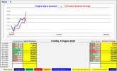
This is a theoretical investment exercise comparing the stock selections of expert fund manager Dr. Don Hamson and Google (AI) Gemini. Both provided their top 5 growth and income stocks for the ASX over the next 12 months.

Results
1st Place $4,608: Google Gemini (AI) - RED line on the equity chart (3 winning positions)
2nd Place $4,405: Dr. Don Hamson (Expert) - BLUE line on the equity chart (3 winning positions)


View attachment 181932


View attachment 181933

Skate.
interesting to see that both managed nice weekly gains despite a very sour end to the week ( and there is currently little between them in cumulative gains/losses )
 
@Skate I remain skeptical about using a one indicator system when all of the entries and exits are based solely on this one indicator. Usually this type of system doesn't perform well in all market conditions and therefore makes it dangerous for new traders to think that is all that they need to do to trade the markets, it could lead to big losses for new traders. If there is more to the system that you are using then this should be made clear to new traders.
 
@Skate I remain skeptical about using a one indicator system when all of the entries and exits are based solely on this one indicator. Usually this type of system doesn't perform well in all market conditions and therefore makes it dangerous for new traders to think that is all that they need to do to trade the markets, it could lead to big losses for new traders. If there is more to the system that you are using then this should be made clear to new traders.
Adding to my previous post: If the system is designed to be used in certain conditions then these conditions should be included in your description of the system.
 
Last edited:
@Skate I remain skeptical about using a one indicator system when all of the entries and exits are based solely on this one indicator. Usually this type of system doesn't perform well in all market conditions and therefore makes it dangerous for new traders to think that is all that they need to do to trade the markets, it could lead to big losses for new traders. If there is more to the system that you are using then this should be made clear to new traders.

@DaveTrade you raise a valid point about the risks of relying solely on one indicator for trading decisions. The MACD from TradingView was chosen for its accessibility and simplicity, making it easier for new traders to grasp the basics of system trading. However, I agree that it’s important to highlight that no single indicator can perform well in all market conditions. While the cosmetic changes are minimal, they help in visualising the strategy more clearly.

I encourage new traders to use this system as a learning tool, understanding that it’s crucial to evaluate and adapt any strategy to different market conditions. The free availability of the code allows for personal evaluation and adjustments, which is essential for developing a comprehensive trading approach.

Skate.
 
1. Comparison Logo.jpg
Comparative Equity Curve Analysis
The displayed equity curve provides a comparative analysis of two trading strategies: (a) the original “Signal Generator”, and (b) the “10-Position Breakout Strategy”. This analysis aims to offer a clear assessment of the relative performance of each approach over time.

1. Original Signal Generator
Represented by the blue line, this strategy serves as the baseline for comparison.

2. 10-Position Breakout Strategy
The red line represents the strategy focusing on confirmed breakout opportunities across ten positions.

3. Combined Weekly Equity Curve.jpg

Skate.
 
View attachment 181988
Comparative Equity Curve Analysis
The displayed equity curve provides a comparative analysis of two trading strategies: (a) the original “Signal Generator”, and (b) the “10-Position Breakout Strategy”. This analysis aims to offer a clear assessment of the relative performance of each approach over time.

1. Original Signal Generator
Represented by the blue line, this strategy serves as the baseline for comparison.

2. 10-Position Breakout Strategy
The red line represents the strategy focusing on confirmed breakout opportunities across ten positions.

View attachment 181989

Skate.
except for the fact the average novice would have too much capital tied up ( in the market and as an emergency buffer ) it would be almost worthwhile running those strategies in parallel

it will be interesting to see if the coming week continues the down-trend and how each strategy copes with that

interesting

cheers

@divs4ever, you raise a valid point about the capital requirements for running these strategies in parallel. It would indeed be interesting to see how each strategy copes with the potential downtrend in the coming week.

The two strategies I’m discussing are separate daily trading strategies
The first, the “Signal Generator,” has its own set of issues, as highlighted by several members. Trading based on a single indicator can be risky, but for this exercise, the goal is to demonstrate to new traders that system trading can be a straightforward way to participate in the markets while they build their trading knowledge, which can take years to develop.

Both strategies have different approaches to judging shifts in momentum
In its purest form the “10-Position Breakout Strategy” was given to me during my Metastock days. I coded it into Amibroker formula language which I switched over. Converting it from Metastock to Amibroker and then into TradingView Pine Script was a challenge, but it was worth the effort.

These two strategies have contrasting ways of moving in and out of positions
The “Signal Generator” typically turns positions over approximately every 14 days, though it can sometimes be the same day. In contrast, the “10-Position Breakout Strategy” has an average hold time of 64 days based on backtesting.

In my opinion
The “Signal Generator” reacts too quickly, while the “10-Position Breakout Strategy” is too slow to respond. Despite these limitations, both strategies are ideal for the exercises being reported on, as they effectively highlight their respective strengths and weaknesses.

Skate.
 
How Does the “Signal Generator” Move In and Out of Positions?
The answer to this question of how the “Signal Generator Strategy” moves in and out of positions lies in its mathematical code that ultimately generates the buy and sell signals. The signals are represented by the “Lime and Fuchsia” dots. I’m overwhelmed by the response to this exercise and the interest it has generated. Member participation allows me to provide additional information for increased clarity of the system being discussed.

How Does the Strategy Work
The strategy uses several input parameters: a MACD fast period, a MACD slow period, and a Signal period with smoothing. The Normalisation period is included for consistency. All calculations are based on the closing price.

The Calculations
The strategy initialises and uses several variables to calculate the Exponential Moving Averages (EMAs) for the fast and slow periods. It computes the MACD value as the difference between the fast and slow EMAs. This MACD value is then normalised over a specified period. The normalised value is smoothed to reduce noise, and a signal line is generated by further smoothing the normalised value.

Generating Buy and Sell Signals
The strategy detects changes in the signal line’s direction. If the signal line turns green (indicating a potential buy), a "lime dot" is plotted. If the signal line turns red (indicating a potential sell), a "fuchsia dot" is plotted. Additional checks are performed to confirm the signal. A "green dot" indicates a confirmed buy signal, while a "red dot" indicates a confirmed sell signal.

In Summary
The strategy reacts to shifts in momentum by calculating and smoothing the MACD values. Buy and sell signals are generated based on changes in the direction of the signal line. The strategy uses colour-coded dots to visually indicate these signals on the chart.

Skate.
 
but in the comparison during the test period , they look to be complementary , maybe in the retrace we can examine that closely under stressful times
 
but in the comparison during the test period , they look to be complementary , maybe in the retrace we can examine that closely under stressful times

@divs4ever regardless of how well a strategy is coded, the trading results simply reflect the characteristics and movements of the markets themselves.

As @Richard Dale succinctly articulated: "In a bull market, you don't need much skill. The skill is in preventing large drawdowns in downtrends/sideways trending markets"

Skate.
 
yes but we are TESTING THIS (no money currently being risked ) aren't you

back-testing runs a similar risk , by say , coming back to the GFC , but by observing whilst the market does it's thing we ( on-lookers ) can evaluate in real time , ( bull market , buy-backs , M&A activity etc now if there is a healthy retrace thrown into the mix we can test the strategies under stress ( for things like is the cash buffer adequate ) are there enough buy signals to make the system operable ,

plenty of danger signs to watch for ( before risking actual cash )

and each user can tweak away at their own version of your experiment if they wish , to test that

what you are doing beats the heck out of standard modeling because it reacts to current conditions as the come both good and bad

( there is a saying that history doesn't repeat , but it sure does rhyme )
 
View attachment 181988
Comparative Equity Curve Analysis
The displayed equity curve provides a comparative analysis of two trading strategies: (a) the original “Signal Generator”, and (b) the “10-Position Breakout Strategy”. This analysis aims to offer a clear assessment of the relative performance of each approach over time.

1. Original Signal Generator
Represented by the blue line, this strategy serves as the baseline for comparison.

2. 10-Position Breakout Strategy
The red line represents the strategy focusing on confirmed breakout opportunities across ten positions.

View attachment 181989

Skate.
@Skate some feedback on your above chart. You already have the dollar figures below the chart and it would be more informative to have the percentage return on the chart as people can then relate the results to their personal capital amount.
 
The strategies presented, though described as systems, do not qualify as such. They are partly rule-based and partly observational, relying on a hand-picked universe of stocks. This approach lacks merit, as there are no defined rules for the stock universe used and no backtest results provided.

Despite claims of backtesting this "proven" system back to 1992, no results have been shared. Experimenting with indicators and testing them against a few stocks might be entertaining, but this does not constitute systematic trading. It’s akin to randomly throwing darts.

This references Burton Malkiel's 1973 book, "A Random Walk Down Wall Street," where he stated, "A blindfolded monkey throwing darts at a newspaper's financial pages could select a portfolio that would do just as well as one carefully selected by experts." A more recent study by Rob Arnott, using survivorship bias-free data, tested 100 sets of 30 randomly-selected stock portfolios from the top 1000 US stocks by market cap, with annual reconstitution. Remarkably, 98 out of the 100 "simian" portfolios outperformed the market-cap weighted index of the same universe.

As @Richard Dale succinctly articulated: "In a bull market, you don't need much skill. The skill is in preventing large drawdowns in downtrends/sideways trending markets"

Yet this is exactly what you've done. Your simian strategy expands a little from Malkiel's book as it adds three more darts to select indicators.

You're missing many critical parts of a trading system. I won't list all of the flaws, but here's some basics.
  • Universe
  • Robustness testing - different universes
  • Confidence testing - add variations to your parameters and see if the system performs similar to your original parameters - if it doesn't, you've probably stumbled on a partciular combination of parameters that are profitable but your confidence in its ability to be profitable should be limited - you've probably curve fitted it
  • Rules for when you have multiple trading signals on a given day
  • Any consideration whatsoever for basic portfolio metrics (eg. risk adjusted returns, Sharpe, drawdown etc.)
Your simian trading strategy is devoid of rigour. It's nothing more than a haphazard exercise in randomly selecting top-cap stocks and indicators during a bull market, followed by dressing it up with attractive visuals and performance charts. Labeling this as "proven" system is blatantly misleading and a gross overstatement.

If you really want to go down the systematic path, you need to educate yourself. Some books off the top of my head (well, I did look at my book case behind me) Niederhoffer, Reminiscences of a Stock Operator (Livermore), All of the Market Wizards interviews in the books by Schwager, various books by Andreas Clenow, various books by Kaufman, various books by Bandy, various books by Radge, various books by Carver, Brent Penfold's two books on trading and trend trading, Antonacci's momentum book. There's a lot more. Plenty of blogs with great information too.

If reading is not your thing, there's some great podcasts: Better System Trader, Algorithmic Advantage, Chat With Traders, Top Traders Unplugged, Meb Faber Show, Covel's Trend Following Radio, to name a few.

With that, I've concluded my comments on your simian portfolios. However, I'm certain that readers have gleaned some understanding of what systematic trading is and what it is not.

1722741585713.png
 
Last edited:
Since we are all sharing many systems (covering all the animals in Noah’s ark), I thought I would share one of my own (very simple, yet very profitable). Back-tests have been performed over the same "statistically significant" period as all the other systems presented in this thread (by others). I know back-testing means “jack”, but here are the details and results:

View attachment 118023

Trading Period = 01/01/2020 to 07/01/2021
Initial Trading Capital = $100,000
Number of Positions = 50
Index Filter = None
Universe = Any ASX Ordinary Stock (including delisted)
Shorting = No

A single run of the strategy results in the following:

View attachment 118024
View attachment 118025

A Monte-Carlo simulation (2000 run) of the strategy results in the following:

View attachment 118026

Profit Stats
Maximum Profit: $187,526.46 (187.53%)
Average Profit: $75,675.56 (75.68%)
Minimum Profit: $9,794.98 (9.79%)
Standard Deviation: $26,124.02 (26.12%)
Probability of Profit: 100.00%
Probability of Loss: 0.00%

Percent Winning Trade Stats
Maximum percentage of winning trades: 53.44%
Average percentage of winning trades: 48.26%
Minimum percentage of winning trades: 44.03%
Standard Deviation: 1.38%

Percent Losing Trade Stats
Maximum percentage of losing trades: 55.97%
Average percentage of losing Trades: 51.74%
Minimum percentage of losing trades: 46.56%
Standard Deviation: 1.38%

Maximum Peak-to-Valley Percent Drawdown Stats
Maximum Absolute Percent Drawdown: 40.4258%
Average Absolute Percent Drawdown: 29.8859%
Minimum Absolute Percent Drawdown: 15.5345%
Standard Deviation: 3.5881%

The code (Metastock + Tradesim) for this strategy is as follows:

Entry = (Ref(ExtFml("TradeSim.Rand"),-1) <= 0.05)
{If yesterday’s randomly generated number is less than or equal to 0.05, then BUY}

Exit = (Ref(ExtFml("TradeSim.Rand"),-1) >= 0.9)
{If yesterday’s randomly generated number is greater than or equal to 0.9, then SELL}

Off coarse the results could be improved by adding an index filter.
 
With that, I've concluded my comments on your simian portfolios.

@Richard Dale, your comments, while personally critical, are truly appreciated. I value the time you take to share your feedback, even when it's harsh. Please don't hesitate to continue posting, even if your feedback tends to be more critical. Your educational insights are invaluable, and I hope you'll keep sharing them, even if they're not entirely positive.

Skate.
 
Top