Australian (ASX) Stock Market Forum

Dump it Here

Pleased to see you start with a market "sentiment" indicator.

Your version 2 looks a bit spotty, too intermittent and it's more off than on even when the index is rising.
(edit: You may be planning on "smoothing" it. sorry if I posted early.)

A mkt filter based on your Ducati blue bars indicator on the XAO would look better.
Hi peter2,

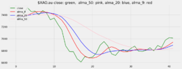
Do you mean something like this?

$XAO.au is the Norgate code for All Ordinaries, here for past 42 days, green line is the 'close' price.
The pink, blue and red lines being respective ALMA moving averages for 50, 20 and 9 days.
Bearing in mind I still have my trader's training wheels still on this graphic suggests the market started a positive move about six days ago.
1658645904072.png

Cheers, e.
 
Why it is too early to say the world economy is in recession
Growth in the rich world is slowing, but has not crashed to a halt

Everyone is a pessimist these days. Barely a day goes by without an economist downgrading their forecasts. On July 14th Steven Blitz of ts Lombard, an investment-research firm, said that he was now expecting a recession this year in the world’s largest economy, a day after Bank of America made the same call. Goldman Sachs, another bank, reckons Germany’s gdp shrank in the second quarter of the year and will also do so in the third. Americans’ Google searches for “recession” have never been so high, and by some distance. TikTok, a short-video platform, is full of clips telling Generation z how to budget as the downturn unfolds. Traders are selling copper (a proxy for industrial health), buying the dollar (a sign that they are nervous) and pricing in interest-rate cuts for next year.

Over the past 18 months a number of factors have combined to create a toxic mixture for the world economy. In response to the covid-19 pandemic America overstimulated its economy, provoking inflation not just within its borders but beyond them, as consumers’ voracious demand for goods bunged up the world’s supply chains. China’s attempts to stamp out covid compounded these problems. Then Russia’s invasion of Ukraine caused commodity prices to soar. In response to the ensuing inflation, roughly four-fifths of central banks worldwide have raised interest rates, by an average of 1.5 percentage points so far this year, causing stockmarkets to slump. The Federal Reserve is expected to raise rates for the fourth time in this cycle, and by three-quarters of a percentage point, after a meeting that ends on July 27th.

Fear of the eventual consequences of monetary tightening is at the root of recession worries. It is clear that central banks have to take the proverbial punchbowl away from the party. Wage growth in the rich world is far too strong given weak productivity growth. Inflation is too high. But the risk is that higher rates will end the party altogether, rather than making it less raucous. History is not encouraging in this regard. Since 1955 there have been three periods when rates in America rose as much as they are expected to this year: in 1973, 1979 and 1981. In each case a recession followed within six months.

20220730_FNC293.png
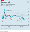
Has recession struck again? Rich-world economies, which account for 60% of global gdp, have without question slowed since the heady days of mid-2021, when covid restrictions were being rapidly lifted and optimism about the future was growing. Goldman Sachs produces a “current activity indicator”, a high-frequency measure of economic health based on a range of surveys and data. The gauge has in recent weeks clearly slowed (see chart 1). Nicolas Woloszko of the oecd, a club of rich and middle-income countries, has derived a measure of weekly gdp from Google-search data. In the past few weeks, he finds, gdp in the rich world has started to look a lot weaker. Surveys of businesses in the euro zone and America released on July 22nd by s&p Global, a data provider, made for grim reading, with manufacturers gloomier than at any time since the early days of the pandemic.
It looks too soon, though, to declare a recession—even if, as some expect, America’s statisticians reveal on July 28th that between April and June the world’s largest economy contracted for the second quarter running. This would count as a recession by one rule of thumb, but it does not pass the smell test. A series of one-off oddities led American gdp to shrink in the first quarter, even though the underlying performance of the economy was strong. It would also be too soon for Fed tightening to have had an effect.

20220730_FNC995.png
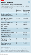
Most economists look to America’s National Bureau of Economic Research (nber) to find out if the economy is truly in recession. Its business-cycle-dating committee considers indicators beyond gdp in making that judgment, including jobs numbers and industrial production. The committee is thought to weigh some factors more heavily than others. The Economist has used a similar approach, with a little guesswork, to judge the health of the rich world as a whole (see chart 2). The exercise suggests that it is hard to argue that a recession has arrived.

20220730_FNC280.png
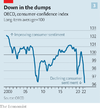
Yet with growth clearly slowing, the big question is how bad things will get. The few remaining optimists point to the strength of households and firms. The public is even gloomier about the economy than it was during the depths of both the global financial crisis and the pandemic (see chart 3). But households across the rich world probably still have some $3trn or so in “excess” savings accumulated during the pandemic, according to our estimates. In America in March 2022, the latest available data, the cash balances of the lowest-income households remained 70% higher than they were in 2019, according to the JPMorgan Chase Institute, a bank-affiliated think-tank.

Moreover, surveys suggest that people seem more confident about their personal finances than about the state of the economy. Across the eu as a whole, households are about one-third more likely to be positive about their own finances than they have been, on average, since the data began in the mid-1980s. In America the share of people who reckon they will be unable to meet debt commitments over the next three months remains below its long-run average, according to a survey by the New York Fed. Various consumer-spending trackers, including from the Bank of England (for Britain) and JPMorgan Chase (for America), still look fairly strong.

Governments across the rich world are also handing out money to help poorer people cope with roaring energy prices. In the euro zone, governments are stimulating the economy by the equivalent of about 1% of gdp. Britain is unwinding the fiscal support put in place during the pandemic, which is dragging on growth, but has nonetheless offered handouts to poor households. In May the Institute for Fiscal Studies, a think-tank, reckoned that such spending would largely compensate the poorest households for the rising cost of living (though retail energy prices are now likely to rise further still).

The behaviour of businesses is also reasonably reassuring. The rate at which companies post new vacancies has slowed somewhat. Apple and TikTok are the latest firms to reportedly pare their recruitment plans. But across rich economies the number of existing open positions is still near a record high. In Australia, for instance, they are more than twice their pre-pandemic level, according to real-time data from Indeed, a job-hiring website. In America there are more than two open positions for every unemployed person.

As a result, labour markets remain tight. You can find some evidence of rising joblessness in the Czech Republic if you squint. Overall, though, the oecd’s unemployment rate is lower now than it was just before the pandemic. In half of oecd countries the share of working-age people who are in a job—a broader measure of labour-market health—is at an all-time high. If history is any guide, these figures are inconsistent with a looming recession.

Declines in investment have in the past played a big role in downturns: in recessionary periods for the g7 group of large economies since the 1980s, around half the fall in combined gdp in negative quarters has come from shrinking capital spending. This time investment data have weakened, but not catastrophically so, according to data for America, the euro zone and Japan, compiled by JPMorgan.

In late 2021 and early 2022 capital spending boomed, as companies spent big on remote-working technology and reinforced supply chains. Now some firms believe they have overinvested in extra supply capacity. Others want to conserve cash. An analysis of survey evidence, financial markets, credit conditions and corporate liquidity by Oxford Economics, a consultancy, suggests that investment in the g7 could decline at an annualised pace of around 0.5% in the second half of this year. That is not good, but it is not enough to create a recession by itself. The investment declines in past recessionary episodes, for instance, were steeper.

Unfortunately there is a limit to the confidence that can be taken from good economic data when the fundamental fear of investors is monetary tightening. Today, news of any kind, it seems, can convey bad news about a recession. Weak data confirm that a downturn is approaching. Strong data, including wage rises, suggest central banks are not succeeding in slowing things down, requiring further tightening, which in turn stands to provoke a recession. However strong consumers and firms look, only signs that inflation is falling will truly dispel fears of a downturn.

20220730_FNC281.png
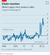
True, there is some relief on the horizon. An index of supply-chain problems compiled by the New York Fed, comprising global transport costs and the opinions of purchasing managers, among other things, has clearly eased, though it remains well above the pre-pandemic norm (see chart 4). Commodity prices have come down since June. American petrol prices at the pump are currently falling by about 3% a week. Alternative Macro Signals, a consultancy, runs millions of news articles through a model to construct a “news inflation pressure index”, which indicates whether the news flow suggests price pressures are building up. The indices for America and Britain have fallen in recent days.

But hopes for a rapid fall in inflation are almost certain to be dashed. Past increases in the price of food and energy have not yet fully filtered into headline inflation rates: Morgan Stanley reckons that rich-world inflation will peak at 8% in the third quarter of 2022. Other than in America’s volatile monthly data, growth in wages shows little sign of easing. In earnings calls companies still talk about how best to pass on higher costs to their customers. On July 21st Russia seemed to indicate that it would not turn off the gas taps to Europe, which if it did would doubtless provoke a recession on the continent. But its promises are not worth much.

The mass of data confronting economists is useful, but an old lesson may still hold: that recessions are hard to spot in real time. The nber dates the start of America’s downturn associated with the global financial crisis to December 2007. But in August 2008 the Fed’s staff thought the economy was still growing at an annual pace of about 2%. Even after Lehman Brothers collapsed later in the year, the imf said that America was “not necessarily” heading for a deep recession. Understanding the economy at the best of times is hard enough; this time it does not help that the post-lockdown economy has been full of surprises. Practically no one predicted that labour shortages would emerge last year, or that inflation would go from bad to worse in 2022.

That is the case for pessimism. The case for optimism is that the present episode of monetary tightening has only just begun. Before it bites there is time for an unusually volatile world economy to deliver more surprises—perhaps even positive ones. ■
 
@JohnDe, sometimes it's hard to work out what going on. Sentiment plays a big part in shifting the markets & any good poker player will tell you that "you can only play the hand you are given".

This thread allows everyone to have their opinion heard
It's handy to read the material you posted but you could have just posted a hyperlink to the article. Personally, I would have preferred to hear your take on the article, or at least you could have expressed your feeling about the article. You could have even posted a chart from the article, one that gets the message across.

Frankly
I'm more interested in what you have to say rather than the so-called experts.

Graph.jpg

The RBA will not increase interest rates in 2022 despite inflation fears
If Philip Lowe from the RBA couldn't get it right when he said “the latest data & forecasts do not warrant an increase in the cash rate in 2022” what chance anyone else will get it right. He went on to explain that Australia will not be sucked into a “perfect storm”. When people talk bull$hit they need to be called out.

Confirmed as bull$hit


Skate.
 
It's handy to read the material you posted but you could have just posted a hyperlink
I didn't realise, when I started to read the post, that it'd be so long winded, but it was well worth it for me , personally.
Had it been a link, I most likely wouldn't have bothered.
That's just me, I guess.
Glutton for info.
 
I didn't realise, when I started to read the post, that it'd be so long winded, but it was well worth it for me , personally.
Had it been a link, I most likely wouldn't have bothered.
That's just me, I guess.
Glutton for info.

@dyna, thanks for making that observation, your comments are important.

After you reading the article
I’d be more interested to read your opinion about the content presented, also what was your main takeaway from the article?

From my perspective
1. Most members won’t take the time to read a lengthy article or post.
2. Most won’t detail their post, let alone take the time to explain a point from their perspective.
3. Cryptic posts & one liners are just as bad, as they leave the reader guessing.

Skate.
 
Ahoy there Officer Skate

If you designed a Ship for Your Maiden Voyage on the ASX
or any other member of the Global Stock Exchanges
Would this Ship Design Look like a Good Start for you?
XYZ Yacht.GIF
It was for me

I ask this as we all start from somewhere
I had a beautiful little red sports car (Triumph Stag)

As life happens as it always does
I found myself needing another Car and It had be a Station Wagon

Life can be Truly Merciless on Land as she can be at Sea

I then came up with a Brilliant Idea to trade the little ship with only a 3 Max Sail area and get a bigger Ship with many more Masts and Sails
"As the Prize Monies Rolled in"

What a Beautiful Ship Design she was and is to this day
HMAS  Ship of Fools.gif

Naturally, As Success breeds Success I designed another Beauty

HMAS Mawson.jpg
There is no crime to "Trade Up"

There is also no crime to do it again and again if One wishes to form a fleet of Magnificent Tall Ships
 
Ahoy there Officer Skate

If you designed a Ship for Your Maiden Voyage on the ASX
or any other member of the Global Stock Exchanges
Would this Ship Design Look like a Good Start for you?
View attachment 144519
It was for me

I ask this as we all start from somewhere
I had a beautiful little red sports car (Triumph Stag)

As life happens as it always does
I found myself needing another Car and It had be a Station Wagon

Life can be Truly Merciless on Land as she can be at Sea

I then came up with a Brilliant Idea to trade the little ship with only a 3 Max Sail area and get a bigger Ship with many more Masts and Sails
"As the Prize Monies Rolled in"

What a Beautiful Ship Design she was and is to this day
View attachment 144520

Naturally, As Success breeds Success I designed another Beauty

View attachment 144521
There is no crime to "Trade Up"

There is also no crime to do it again and again if One wishes to form a fleet of Magnificent Tall Ships

@Captain_Chaza, I know exactly what you mean.

Skate.
 
Let's concentrate on the lower chart
The ribbon on the lower chart "Skate's WTT Percentage Filter Strategy" uses the percentage of the index to drive the colour of the ribbon. As you can see the "spottiness" of the ribbon @peter2 is referring to but in reality, this means you are restricted in buying when the ribbon is red. I use this indicator as part of the "Stale Stop" exit strategy that ensures the open position is sold when the percentage of the index is below a certain value. Using this method concentrates on capital preservation. This indicator (filter) is perfect for those that "feel twitchy" or "nervous" when deciding to take a punt.

The Indicator
This indicator simply displays the number of advancing stock of the All Ordinaries compared to the number of declining stock as a percentage. Now the coding is not simple & there is a heavy drag when searching for signals or when doing backtesting (because of the looping required) but it's a small price to pay when you want to use an alternative to using a simple moving average of the index.

At the moment
As the All Ordinaries (XAO) is currently (67%) that's above the threshold of (50%), indicated by the red horizontal line. When this happens the ribbon turns green indicating it's "safe to trade", whereas the 10-week (SMA) ribbon indicates it is not safe to trade as the ribbon is displaying "red" keeping you out of an advancing market.

View attachment 144470


Skate.
#Skate . I am very interested in your Advance decline ratio. Is this a calculation using Norgate tickers e.g #XAOADV.au is no. of advancing issues. I can't get a calculation to match yours.
 
#Skate . I am very interested in your Advance decline ratio. Is this a calculation using Norgate tickers e.g #XAOADV.au is no. of advancing issues. I can't get a calculation to match yours.
I like the fact that this ratio is removing the weight of the asx monsters big banks bhp rio etc which are seldom relevant/used in our system but do not really understand how it could be more reactive than a moving average of same weightless asx or xao.
I previously trialled xnt MA instead of xao/asx200 MA filter with no real edge detected
Sadly too busy right now to investigate further but will ASAP
 
#Skate . I am very interested in your Advance decline ratio. Is this a calculation using Norgate tickers e.g #XAOADV.au is no. of advancing issues. I can't get a calculation to match yours.

@investtrader, let me explain
The calculations use Norgate Data, in particular, the All Ordinaries ($XAO.au). I hard code the mathematical calculations & placed the code in a "for loop" doing it this way I believe my results are accurate but the heavy looping slows the runs of the Exploration Analysis & Backtesting. The exercise was to explain a method I personally use to keep me on the right side of the market.

Skate.
 
I like the fact that this ratio is removing the weight of the asx monsters big banks bhp rio etc which are seldom relevant/used in our system but do not really understand how it could be more reactive than a moving average of same weightless asx or xao.
I previously trialled xnt MA instead of xao/asx200 MA filter with no real edge detected
Sadly too busy right now to investigate further but will ASAP

@qldfrog, you nailed it
The All Ordinaries are driven by the top 4 banks & a few majors which slant the "Index". Take it from me if they, the Banks have a good day, the markets have a good day.

All I'm saying, there are alternatives
The other major issue using "moving averages" as an indicator is the "lag" factor. I explained there was an alternative method, one of many, to keep you on the right side of the market. I'm sure @entropy got it because in his reply to @peter2 he stated that "the market started a positive move about six days ago", & using the "percentage method" I explained takes advantage of this. Using "moving averages" as the indicator & you are guaranteed to miss an opportunity.

Skate.
 
Last edited:
@JohnDe, sometimes it's hard to work out what going on. Sentiment plays a big part in shifting the markets & any good poker player will tell you that "you can only play the hand you are given".

This thread allows everyone to have their opinion heard
It's handy to read the material you posted but you could have just posted a hyperlink to the article. Personally, I would have preferred to hear your take on the article, or at least you could have expressed your feeling about the article. You could have even posted a chart from the article, one that gets the message across.

Frankly
I'm more interested in what you have to say rather than the so-called experts.

View attachment 144515

The RBA will not increase interest rates in 2022 despite inflation fears
If Philip Lowe from the RBA couldn't get it right when he said “the latest data & forecasts do not warrant an increase in the cash rate in 2022” what chance anyone else will get it right. He went on to explain that Australia will not be sucked into a “perfect storm”. When people talk bull$hit they need to be called out.

Confirmed as bull$hit


Skate.


Sorry that I annoyed you Skate. It was a very busy day, I had just read the article and thought that it would be handy for some investors here. Normally I would comment but it was my first born 25th birthday and I had to rush home because we were taking the family out for a celebratory dinner.

Walking to the restaurant/bar that we had booked I saw that the cafes and restaurants above 50% capacity, not bad for a cold Monday night on the outskirts of the city. Our dinner was delicious, the place was at about 75% capacity, lots of laughter, food and drink being consumed.

I think that we are a fair way from a recession in Australia, our unemployment level is extremely low and people still have disposable income. Many places in the world are in the same situation, and as long as all the Reserve Banks don't push the interest lever too hard and too fast we all may miss a hard recession.

I'll refrain from posting anymore articles if I can't comment, which is most likely going to mean less articles. We are extremely busy, and have to turn away work so as not to burn out my team, and myself.
 
Last edited:
@investtrader, let me explain
The calculations use Norgate Data, in particular, the All Ordinaries ($XAO.au). I hard code the mathematical calculations & placed the code in a "for loop" doing it this way I believe my results are accurate but the heavy looping slows the runs of the Exploration Analysis & Backtesting. The exercise was to explain a method I personally use to keep me on the right side of the market.

Skate.
Okay, so ýou are using a 'private index'..

I don't really use index filters, except in a very limited way. I have found they reduce performance quite a lot and don't really reduce drawdown that much. Within my systems I it pay attention to the number of buy and sell signals. For example, on 28/2/20 I had 167 sell signals. A record. I know what that said. On 10/4/20 I started getting quite a good numbers of buy signals over the next few weeks. A huge rally followed after that.
In the last 2 weeks there are have been quite a few buys . Not enough for me to go to 100% yet, even though there are enough signals to fill the portfolio. I also watch, but don't incorporate in my code #XSO26WHL.au .
I want to do more work on this when I have time but my system does not lag - when it is bullish I get buys. I can't think how how I could plot no of buys and no of sells over time without doing it manually.
So I combine these things with watching my equity curve over the three systems I trade.That is my GTFO filter, as you so aptly called it.
 
Sorry that I annoyed you Skate.

@JohnDe, first off I should say I wasn't annoyed. I appreciate every post, even the ones that point out my shortcommings.

I think that we are a fair way from a recession in Australia, our unemployment level is extremely low and people still have disposable income. Many places in the world are in the same situation, and as long as all the Reserve Banks don't push the interest lever too hard and too fast we all may miss a hard recession.

Now you're cooking
If you had posted a short description (as above) & a hyperlink to the article, in my opinion, would have made for better reading. When someone expresses an opinion it stimulates others to think about theirs. A few words can explain so much & your opinion on the article holds more value to me than the article itself. My preference is for you to keep posting as it helps others, the main purpose of this thread.

Skate.
 
Within my systems I it pay attention to the number of buy and sell signals

@investtrader, as traders we are all different. Any indicator that gives you an edge is the one to use. I also agree that the ratio of buys & sells gives an inkling of what the market is doing at any one time. I have mentioned this in a previous post.

How do I know when my strategy is performing?
On a regular basis, I take notice of the number of closed trades from a "Take Profit Stop", that one metric indicates (a) not only how the market is traveling but (b) how inline the strategy is with the index being traded.

Skate.
 
(Skate Quote)
The "Stale Stop Exit" is a little more complex
The Stale Stop Exit does a mighty job & is a combination of 6 conditions.
It's extremely difficult for me to explain how it works without revealing the complex coding involved.

As they say, a picture paints a thousand words
I have coded my version of the WTT from the material I've found freely on the web. If the chart is inaccurate I'm sure someone will point it out to me. The exercise today is to visually demonstrate why a "Stale Stop Exit" is important & the advantage of using one in any strategy.

Disregarding the non-performers quickly frees up capital
The holding period of a position is critical to profitability. When a position goes stale, what's the use of staying with it, funds could be applied elsewhere. It's really hard to know when a position is stale, but not impossible. At times you can exit prematurely, but it's no biggy as you can re-enter at any time.

Staying too long when momentum slows is a recipe for pending disaster
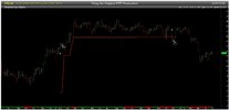
Sure trends can last a long time, & at times will take a break before heading higher. But the majority of the time they don't, they fluctuate with great regularity & at times just go sidewards, that is my area of concern that is shown on the chart below.

Original.jpg

Skate.
 
Staying too long when momentum slows is a recipe for pending disaster

As they say, a picture paints a thousand words
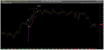
I have coded "my version" of the WTT from the material I've found freely on the web but now the strategy has an additional exit. Both the "Original" & "Skate's Version" of the WTT Strategy is subject to a "simple moving average" (SMA) index filter to generate signals.

But here is the twist
"Skate's WTT Version" incorporates a "Stale Stop Exit" whose sole purpose is to free up capital that's looking for a new home. Also, I've colour coded the trailing stop as a visual reminder when the "Index Filter" is on & when it is off. The "Red" portion of the trailing stop denotes that the "Index Filter" is on. The "Pink" coloured portion of the trailing stop denotes that the "Index Filter" is off.

Disregarding the non-performers quickly frees up capital
The holding period of a position is critical to profitability.

WTT v1.jpg

Skate.
 
Last edited:
Both the "Original" & "Skate's Version" of the WTT Strategy is subject to a "simple moving average" (SMA) index filter to generate signals.

Twisting the strategy
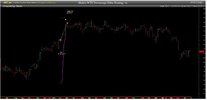
Instead of using a "simple moving average" (SMA) to generate the signals, I use the percentage of the index to generate both signals. The only difference to "Skate's WTT Index Filter Strategy v1", version 2, uses the 50% ratio of advancing stocks compared to the number of declining stocks to generate the buy signal.

Now here is the twist
The sell signal is generated when this ratio falls below 25%. This is an additional "exit condition" annexed to the "Stale Stop" exit strategy. This "Percentage Filter" parameter forms part of the "Stale Stop" exit strategy that ensures the open position is sold when the percentage of the index is below a certain percentage value of 25%. Using this method concentrates on capital preservation & it's perfect for those that "feel twitchy" or "nervous" when deciding to have a punt.


WTT v2.jpg

Skate.
 
When things don't make sense
I'm new to Twitter & I've found it astounding that there is so much free trading information being distributed. When others post their trading results it can make you happy & sad at the same time. When good traders are generously displaying their own personal results it allows you to benchmark the results you are achieving.

But sometimes the figures are confusing
The figures presented below don't make sense to me nor does it add up using my calculator. I recently compares the two most recent results posted & found myself confused.

Why am I confused?
1. On the 16th of July, the YTD PnL was reported to be -$822,625
2. The weekly PnL was reported as +$2,361
3. The new weekly PnL is now -$822,573.
4. I'm unsure how it makes sense

16th and 23rd July 2022.jpg

I'm sure there will be a simple answer
It's most likely that only the daily figures posted have been used in the YTD PnL calculations & the other days not reported are not included.

This has led me to ponder other questions
1. When our returns are patchy or disappointing, what is the cause?
2. When do we accept the strategy is not performing as before?
3. What system should we have in place to benchmark our strategy?
4. How much should we be prepared to lose before pulling the strategy from the markets?
5. Is it possible to retune your strategy when market conditions change?
6. How do we know the markets have changed?

Summary
I'm a firm believer that if you're not evolving you will quickly become like the Dinosaures, extinct.

Skate.
 
Top