Australian (ASX) Stock Market Forum

Dump it Here

@Skate and others, the insight you provide makes my brain juices flow. The research doors are wide open. Particularly the last few posts. Thank you

Uurgh, they are just like bloody party streamers all over my charts. I tried them out for about a minute when Colin added them to the indicators list until the untidiness and unnecessary junk got in my way.

Guppy's Multiple Moving Averages
As trend trading strategies go, using "Guppy's Multiple Moving Averages" would be a suitable choice as it's easy to follow & understand. The relationship between the 12 exponential moving average (EMA) tells the story of long & short-term buyers.

Guppy's Multiple Moving Averages (GMMA)
The multiple lines of the Guppy help traders see the strength or weakness in a trend better than if only using one (or two) EMAs. The 12 EMAs are separated into two groups. Compression to the expansion of the “lines of the ribbon” tells one story whereas the reverse (expansion to compressions) tells another. On the other hand, the "crossing" of the ribbons, is a whole other story in itself. The GMMA ribbon (the indicator) identifies the trend, the strength of the trend & the reversal of the trend.

GMMA Ribbon Colours
The short-term investors are represented by the “Blue Ribbon” & the longer-term investors are represented by the “Red Ribbon”. To keep the post short, those interested can do their own research as to how these lines (of the ribbon) interact. We can use the association of the "GMMA ribbon" (the lines) to our advantage. The downside to (GMMA) it’s a "lagging indicator" that will never catch the low of the pivot but at times goes very close.

Twisting the GMMA
I’ve twisted Guppy’s idea. I've taken the average of Guppy's slow & fast-moving (EMA's) then added a smoothing factor. Using the average of the EMA bands (IMHO) sharpens the usefulness of the indicator allowing me to turn the GMMA indicator into a complete trend trading strategy.

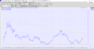
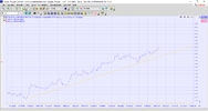
Weekly (FMG) Chart
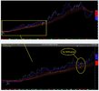
FMG GUPPY with Covid Period.jpg


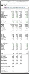
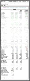
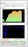
Guppy's MMA - 2 year backtest
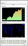
This backtest includes the COVID period to demonstrate how this strategy handled this trading period. Overall it was mighty disappointing but overall it recovered nicely.
GMMA Backtest.jpg


GMMA Equity Curve.jpg


Guppy's MMA
Don't forget I’ve twisted Guppy’s idea. I've taken the average of Guppy's slow & fast-moving (EMA's) then added a smoothing factor. This in itself is worthy of the exercise. Twisting it up, I've used the average of the EMA bands to sharpen the usefulness of the indicator allowing me to turn the GMMA indicator into a complete trend trading strategy. It's not a perfect trend trading strategy but it's simple to follow & implement. In my opinion, don't discard Guppy's idea too quickly as a trend following system or indicator. (more lines are better than one)

Summary
The 'Dump it here' thread is about ideas, ideas that I've found helpful in my trading experience.

Skate.
 
Over the past few months the media has certainly been ramping up the prospects on an imminent interest rate rise and of course the media being the purveyors of doom and gloom that they are like to claim the share market will be headed to Armageddon once we get an interest rate hike. So today's article in the AFR (headline below) got me thinking--how exactly has the market reacted to RBA cash rate increases. Unsurprisingly the facts are very different to the media's perspective.

interest rates.JPG

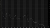
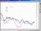
So let's take a look back at the RBA's official cash rate going back to 1990--cash rate is shown below.

RBA Cash Rate.JPG

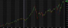
Now let's look at the XAO for the same period (today back to around 1990)

XAO.JPG

A few key observations:

a) During the period from around 1990 to 1993 the RBA cash rate experienced a dramatic decline of over 50% yet during this rapid decline in the cash rate the XAO seemed to have a period of just moving sideways. Certainly there was no remarkable movement in the XAO that you might otherwise expect to be the result of a significant decline in the cost of money.

b) We saw amazing growth in the XAO from around 2003 to 2007, but guess what? During this period RBA cash was also increasing and in fact it rose about 50% over this period.

c) We then had the GFC kick in in 2008 and while the XAO experience a significant decline so to did the RBA's cash rate.

d) Finally, during the period from 1994 to 2002 we experience some volatility in the RBA's cash rate but despite the ups and down of the cash rate the XAO just kept on marching upward

So, despite the AFR's headline today I'm not too sure that history shows us that the market does not react well to hikes in the RBA cash rate. Sure, in the short term an increase in the RBA might scare the market a little but history would appear to suggest that the market will brush off the rate hike and continue along its merry way.
 
Guppy's Multiple Moving Averages (GMMA)
The multiple lines of the Guppy help traders see the strength or weakness in a trend better than if only using one (or two) EMAs. The 12 EMAs are separated into two groups. Compression to the expansion of the “lines of the ribbon” tells one story whereas the reverse (expansion to compressions) tells another. On the other hand, the "crossing" of the ribbons, is a whole other story in itself. The GMMA ribbon (the indicator) identifies the trend, the strength of the trend & the reversal of the trend.

GMMA Ribbon Colours
The short-term investors are represented by the “Blue Ribbon” & the longer-term investors are represented by the “Red Ribbon”. To keep the post short, those interested can do their own research as to how these lines (of the ribbon) interact. We can use the association of the "GMMA ribbon" (the lines) to our advantage. The downside to (GMMA) it’s a "lagging indicator" that will never catch the low of the pivot but at times goes very close.

Twisting the GMMA
I’ve twisted Guppy’s idea. I've taken the average of Guppy's slow & fast-moving (EMA's) then added a smoothing factor. Using the average of the EMA bands (IMHO) sharpens the usefulness of the indicator allowing me to turn the GMMA indicator into a complete trend trading strategy.

Weekly (FMG) Chart

View attachment 135170


Guppy's MMA - 2 year backtest
This backtest includes the COVID period to demonstrate how this strategy handled this trading period. Overall it was mighty disappointing but overall it recovered nicely.

View attachment 135174


View attachment 135175


Guppy's MMA
Don't forget I’ve twisted Guppy’s idea. I've taken the average of Guppy's slow & fast-moving (EMA's) then added a smoothing factor. This in itself is worthy of the exercise. Twisting it up, I've used the average of the EMA bands to sharpen the usefulness of the indicator allowing me to turn the GMMA indicator into a complete trend trading strategy. It's not a perfect trend trading strategy but it's simple to follow & implement. In my opinion, don't discard Guppy's idea too quickly as a trend following system or indicator. (more lines are better than one)

Summary
The 'Dump it here' thread is about ideas, ideas that I've found helpful in my trading experience.

Skate.
Guppy relies on an average of ema on different period( raw summary) so obviously can lag a bit due to the longuer period of some of these ema.
Without revealing trade secret, you can obviously tweak this to weight various periods differently and so bring back some responsiveness..
Hope it helps:
i trade a guppy based system.
Time will tell


Obviously, a person can create whatever group of MAs in any time frame they wish. One could always experiment with different times of MAs both simple, weighted, or exponential. Guppy has the short-term MAs typically set at 3, 5, 8, 10, 12, and 15 periods. The longer-term MAs are typically set at 30, 35, 40, 45, 50, and 60 according to Investopedia.

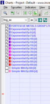
Ignoring the bottom two MAs of 50 and 200 on the chart which are mine, you can play with the MAs by switching on and off MAs in the tick box. I tried that back in the day but I still found it obliterated the chart information for me and I just missed so much, as by then it had been a few years and I had learned to chart without gimmicks. But it could work as a basis for creating a personalized group if so desired.


Guppy MAs.png
 
Obviously, a person can create whatever group of MAs in any time frame they wish. One could always experiment with different times of MAs both simple, weighted, or exponential. Guppy has the short-term MAs typically set at 3, 5, 8, 10, 12, and 15 periods. The longer-term MAs are typically set at 30, 35, 40, 45, 50, and 60 according to Investopedia.

Ignoring the bottom two MAs of 50 and 200 on the chart which are mine, you can play with the MAs by switching on and off MAs in the tick box. I tried that back in the day but I still found it obliterated the chart information for me and I just missed so much, as by then it had been a few years and I had learned to chart without gimmicks. But it could work as a basis for creating a personalized group if so desired.


View attachment 135188
Indeed and as systematic trader, i just adopt a set of weight /period parameters which statistically work for my system on a given period, very different from the visual chartist in you Ann.
My approach will always be sub optimal at a specific time.but i think peope now understand and fit to their needs/approaches
 
Guppy's Multiple Moving Averages (GMMA)
The multiple lines of the Guppy help traders see the strength or weakness in a trend better than if only using one (or two) EMAs.

There are only three trends one needs to recognize on a chart, up, down or across. MAs of any colour, time period or quantity are really unnecessary to ascertain this. Simple hand drawn trendlines, preferably drawn on an EOD chart will tell you what you need to know.
One needs to select a time period as charts can be going up at the same time the trend is going down or vice versa!! ?

For instance, TLS. I like to pull right back as far as possible to see the full picture on any chart, it can tell you a lot. The long term trendline from its time of listing is falling but the shorter term price trend is going up. All I need are two trendlines, clean and simple. No MAs, nothing, simple as it gets. Just a very basic skill, nothing genius or complex. As an old IC contributor used to say, even blind Freddy could see this. I will add my own saying, even dopey Dora could draw these trendlines.


TLS trend 31.12.21.png
 
Indeed and as systematic trader, i just adopt a set of weight /period parameters which statistically work for my system on a given period, very different from the visual chartist in you Ann.
My approach will always be sub optimal at a specific time.but i think peope now understand and fit to their needs/approaches
May I be a Dopey Dora and get you to rephrase these two sentences, I truly have no idea what you are saying. Dyslexia, sorry.
 
Over the past few months the media has certainly been ramping up the prospects on an imminent interest rate rise and of course the media being the purveyors of doom and gloom that they are like to claim the share market will be headed to Armageddon once we get an interest rate hike. So today's article in the AFR (headline below) got me thinking--how exactly has the market reacted to RBA cash rate increases. Unsurprisingly the facts are very different to the media's perspective.

View attachment 135183

So let's take a look back at the RBA's official cash rate going back to 1990--cash rate is shown below.

View attachment 135186

Now let's look at the XAO for the same period (today back to around 1990)

View attachment 135187

A few key observations:

a) During the period from around 1990 to 1993 the RBA cash rate experienced a dramatic decline of over 50% yet during this rapid decline in the cash rate the XAO seemed to have a period of just moving sideways. Certainly there was no remarkable movement in the XAO that you might otherwise expect to be the result of a significant decline in the cost of money.

b) We saw amazing growth in the XAO from around 2003 to 2007, but guess what? During this period RBA cash was also increasing and in fact it rose about 50% over this period.

c) We then had the GFC kick in in 2008 and while the XAO experience a significant decline so to did the RBA's cash rate.

d) Finally, during the period from 1994 to 2002 we experience some volatility in the RBA's cash rate but despite the ups and down of the cash rate the XAO just kept on marching upward

So, despite the AFR's headline today I'm not too sure that history shows us that the market does not react well to hikes in the RBA cash rate. Sure, in the short term an increase in the RBA might scare the market a little but history would appear to suggest that the market will brush off the rate hike and continue along its merry way.


The issue is the 'real' return:

Screen Shot 2022-01-04 at 5.32.55 PM.png

The trend in rates is down, save for the Taper Tantrum in late 2018 early 2019 which caused the Fed to reverse. Stocks (assets) like low rates. The capitalisation rate is the inverse of real yield.

Screen Shot 2022-01-04 at 5.37.17 PM.png

Real yield is visualised as the interplay between yields/PPI/CPI. When yields are low, what matters is whether PPI is inflating faster than CPI. This is the input costs v output sales revenue. As long as the margin is positive for CPI, companies (stocks) are profitable.

Screen Shot 2022-01-04 at 6.03.48 PM.png

PPI inflation is a function of commodity prices, which are themselves a function of investment and production. High commodity prices encourage mal-investments which leads to over-production, think US Shale. These are eventually liquidated in deflationary busts (US housing 2008, US Shale 2020, etc).

Low prices create low investment, which leads directly to low production, which leads back to low supply, which leads to rising prices, particularly when yields are low due to monetary stimulus. Of course credit creation went off the charts in 2020/2021.

The real rate is nominal yield less inflation. So currently the real yield is negative. Stonks will continue until the market believes that Central banks will continue to raise rates into a positive return...which currently means rates on the 10yr at 8%.

If rates went to 8%+, stonks would shed 90%+

The thing is rates do not need to get to 8%. Rates might only need to get to 2.5% to trigger a market crash, say 15%+ decline, at which point I'm betting the Fed are straight back down to ZIRP which is a real NIRP. That is a 100pt basis point move from where we are.

There is no 'taper' yet:

Screen Shot 2022-01-04 at 6.31.16 PM.png

The Fed states: by March 2022, ZERO QE (from the current $250B/month). That will give you your 100bp virtually overnight and probably a fair bit more. Do you think Mr Powell will stand pat and continue the taper?

Of course that will NEVER happen (nor will a yield above the rate of inflation) with the current leadership as that would create an epic deflation, crushing over a QUADRILLION dollars in debt and derivatives worldwide. The GFC would look like the teddy bears picnic.

Rather, we will continue to jawbone, now we taper, now we don't, until the inflationary pressures become so pernicious that the currency collapses. If DXY goes, so do most other fiats. Russia and China have built significant gold reserves, which, if allocated to backing their fiat currencies, could save them. The Fed claims 8000 tons. True, false?

The interesting question is BTC? Does it collapse or actually act as a store of value? If it collapses, Mr Saylor and MSTR are consigned to the history books.

jog on
duc
 
The MAs in the GMMA are exponential MAs. It's possible to change them to simple, weighted or any other calculation type. A system back tester can do this easily to discover which MA type works best for their system.

MAs in general are sub-optimal in that they don't always work as well as we like, especially in non trending markets. It's import that we understand the strengths and weaknesses in our systems and that they fit our personality.

People either "get " the GMMAs or they don't. Their real advantage is indicating the strength of the trend. When the shorter term MAs move apart from the longer MAs the trend is strong. If the trend is strong don't sell the short term pull-backs.
 
People either "get " the GMMAs or they don't. Their real advantage is indicating the strength of the trend. When the shorter term MAs move apart from the longer MAs the trend is strong. If the trend is strong don't sell the short term pull-backs.

But Peter wouldn't you agree these two lines will tell you all you need to know about the (shorter-term) trend, still using the example of TLS. The pace of the trend is picking up within the already rising trend. If the price falls off the quicker rising trend and settles back on the slower upward trend, then one also would not sell. However, if the price fell off the slower trendline then perhaps an exit may be considered after a simple sideways consolidation was discounted. Clean, easy, clear, simple.

TLS uptrend 31.12.21.png
 
The thing is rates do not need to get to 8%. Rates might only need to get to 2.5% to trigger a market crash, say 15%+ decline, at which point I'm betting the Fed are straight back down to ZIRP which is a real NIRP. That is a 100pt basis point move from where we are.

Interest rates per se haven't triggered market crashes--broader economic/social woes do, but not interest rates. Let's look back to our recent crashes--the 2000 dot.com crash was triggered by massive overvaluations that came home to roost. The 2008 crash was triggered by defaults of junk mortgage backed securities and the 2019 crash was triggered by fear of the sky falling in because of covid. So I don't think there is anything to suggest that interest rates getting back to 2.5% per se will trigger a stock market crash.
 
May I be a Dopey Dora and get you to rephrase these two sentences, I truly have no idea what you are saying. Dyslexia, sorry.
being a systematic trader means I need to have a one fit all approach within my realm: SP range, index belonging so it is a given that i will not have the greater optimisation that you require as a visual chartist

no dyslexia here but english as a 2nd / 3rd language so I produce a lot of garbage.but well intented..well that is my genuine purpose...
.and here i am on the computer..when on the smartphone keyboard, i am pathetic
My apologies Ann..I also tend to be too..far too verbose..the latin side in me
 
Turning ideas into code is simple
"Guess-working" a chart is time-consuming & is at the mercy of interpretations. Coding is pretty straightforward & it's easy to chart positions to understand the logic behind the idea. Below is the code from Cesar Alvarez. It proves that you don't need to re-invent the wheel.

Coding an idea
Coding a trading idea stands "head & shoulders" above all other tools mentioned above (IMHO). A trend trading strategy is the perfect tool to have in our trading toolbox. Mechanical System Trading is the simplest way to trade that I've found. Trading this way takes little skill & involves only minutes a week. If you can press one button you have the skill.

Cesar Alvarez
Back in February 2015, Cesar made reference to a unique PositionScore he was discussing at the time. Below is a simplified version of the positionscore that was under discussion. The original code was not disclosed. I've used weekly bars for the calculation but I assume his code is much more complicated. The code below should give nearly the same results that are worthy of further research

PositionScore
nWeek = 20;
PositionScore = 100+ROC(C, 5*nWeek);

Cesar HHV - entry & exit strategy
Cesar often quotes a simple entry & exit strategy to explain his theory. I have used a simple 20-period breakout that will fit nicely to evaluate his positionscore.

20-period Strategy
HighestValue = Ref(HHV(H, 20), -1);
LowestValue = Ref(LLV(L, 10), -1);
Buy = C >= HighestValue;
Sell = C <= LowestValue;

1 year backtest

Skate's Cesar 20-period Backtest.jpg


Equity Curve

Skate's Cesar 20-period Equity.jpg


There's enough free material on the internet, in the library, on youtube, that you should never have to pay for anything.

Summary
Trading ideas need not be complicated. The backtest results above is the combination of Cesar Alvarez "entry & exit" condition using his reconstructed positionscore. Combine the two into a simple trend trading strategy & the results are not half bad. For those looking for a trend strategy, the code above is a starting point.

Skate.
 
being a systematic trader means I need to have a one fit all approach within my realm: SP range, index belonging so it is a given that i will not have the greater optimisation that you require as a visual chartist
Apologies froggie, I had no idea English was your second language. Sometimes I can pick accents within the written word but not with yourself. This is what I am hearing you say, please correct me if I have misunderstood.


"being a systematic trader means I need to have a one fit all approach within my realm:" = I understand this to mean- I want a simple way to trade where I don't need to think about it.
Fair enough as long as it is making you constant and sustainable profits. If not then perhaps you may need to find another simple system where you don't need to think about it or potentially not trade until you can work out a better way.

no dyslexia here but english as a 2nd / 3rd language so I produce a lot of garbage.but well intented..well that is my genuine purpose...
.and here i am on the computer..when on the smartphone keyboard, i am pathetic
My apologies Ann..I also tend to be too..far too verbose..the latin side in me

You are certainly are not pathetic, nor verbose and I have never read garbage from you. That is why I was so keen to understand what you were saying to me. I find with dyslexia, I have trouble with comprehension, I fully understand each word but in combination over a sentence or two, it can become totally meaningless. That is why I like to read @Skate, as he puts up a bold heading and then with very few words explains what he is trying to say. This is really the best way for Dyslexics to read.

My approach will always be sub optimal at a specific time.but i think peope now understand and fit to their needs/approaches

I am reading this as meaning "I could do better if I had the time and energy" Fair enough! I think the most important part of all is if you are having fun. Qudos to you for putting your trading on display. I need to make more time to enjoy other peoples' trading journals.
 
Apologies froggie, I had no idea English was your second language. Sometimes I can pick accents within the written word but not with yourself. This is what I am hearing you say, please correct me if I have misunderstood.


"being a systematic trader means I need to have a one fit all approach within my realm:" = I understand this to mean- I want a simple way to trade where I don't need to think about it.
Fair enough as long as it is making you constant and sustainable profits. If not then perhaps you may need to find another simple system where you don't need to think about it or potentially not trade until you can work out a better way.


You are certainly are not pathetic, nor verbose and I have never read garbage from you. That is why I was so keen to understand what you were saying to me. I find with dyslexia, I have trouble with comprehension, I fully understand each word but in combination over a sentence or two, it can become totally meaningless. That is why I like to read @Skate, as he puts up a bold heading and then with very few words explains what he is trying to say. This is really the best way for Dyslexics to read.


I am reading this as meaning "I could do better if I had the time and energy" Fair enough! I think the most important part of all is if you are having fun. Qudos to you for putting your trading on display. I need to make more time to enjoy other peoples' trading journals.
your point about bold and and concise text is nice to know.
I will try to use..will probably take me a while to master but i will try
Thanks for the feedback
 
No on the contrary Skate, I must disagree, the SMA is not a lag because it is a watched signal/indicator, a trigger for the dozens, hundreds or thousands of traders waiting for an entry indicator/signal/whistle blow/ trigger/gunshot/ whatever you want to call the point where the trader commits his money. Many people try to get very clever with MAs thinking they will get an edge. If you are using a less used MA, you will have a less-used entry/exit point. The best edge anyone can ever have is to know when the majority of traders are going to commit to a trade, that is why I use the 'simple' MA as that is the standard-setting on Stockcharts, the 50dsma and 200dsma. More traders would use Stockcharts than any other chart system around. I want to be right in the thick of the herd so I can get the go signal as it happens.
Ann,
Great analysis. Not only are traders watching the 200MA, but investors.
 
1. Interest rates per se haven't triggered market crashes--broader economic/social woes do, but not interest rates.

2. Let's look back to our recent crashes--the 2000 dot.com crash was triggered by massive overvaluations that came home to roost.

3. The 2008 crash was triggered by defaults of junk mortgage backed securities and the 2019 crash was triggered by fear of the sky falling in because of covid.

4. So I don't think there is anything to suggest that interest rates getting back to 2.5% per se will trigger a stock market crash.


1. Interest rates are always there in the mix. Particularly when valuations are stretched and bubbles have formed.

2. The 2000 period: yields rose throughout 1999.

Screen Shot 2022-01-05 at 6.39.52 AM.png

3. And why did junk bonds default? Because they were ARMs (Adjustable Rate Mortgages) that were set very low with teaser rates that then adjusted higher once the teaser period was over. The crash was the most expected crash ever.

Screen Shot 2022-01-05 at 6.41.39 AM.png

Rates rose into 2007.

Screen Shot 2022-01-05 at 2.40.01 PM.png

Rates were cut quickly, then raised back, which created a further collapse and down they came again.

3. In 2019 we had the first 'Taper Tantrum' and rising rates were squashed. When COVID hit, rates went to the lowest nominal ever since the 1930's. Real rates have since then turned negative (NIRP) due to the re-emergence of inflation.

4. Yields at a nominal 2.5% are still in real terms negative. What I am saying is that at 2.5% +/-, the market will start to believe that the Fed actually means business and will throw another tantrum via a sell-off. The Fed will (IMO) cave in and lower rates again.

Actually what we are really talking about is the withdrawal of QE. QE is actually far more inflationary to asset prices than are interest rate hikes (monetary policy) and the rise of 100bp nominal yield does not truly reflect the loss of inflationary stimulus that the banks currently enjoy via QE.

If/when QE taper is implemented, watch how fast the financials sell-off. The financials support the broader market of stonks. Following fast on the heels of the financials will be the indices because the banks tend to buy sector ETFs rather than individual stonks.

jog on
duc
 
I'd agree that interest rates didn't cause the 2000, 2008 or 2020 bear markets (sorry - I've never liked the word 'crash'). However, I'd also say it is possible that interest rates could indirectly cause a bear market. We've lived through a time of seemingly ever reducing rates (but I for one can remember having a home loan at 13%!) so having ridden the elevator to the basement there is only one way for rates to go. Rising rates dampen consumer confidence and impact company profits (which filters through to the share price).
Central banks have always been able to influence rates by reducing the cash rate, but that won't work any more and I'm not sure they can stop rates from rising, pushing up inflation and scaring the beejeezus out of investors. Rising interest rates also result in investors moving cash from equities to other investments. Australia is one of the most personally indebted nations in the world where many have borrowed to the hilt. When rates were say 5% and moved up to say 6% it would see a 20% increase in interest repayment (which is pretty massive) but with loans of say 2% rising by the same 1% means a 50% increase in interest payments and a pretty massive flow on to inflation and mortgage distress.

That said, I think we'd need a confluence of negative events to see a bear market and interest rates (which go hand in hand with inflation) might be just one of the contributory factors. Unless something major happens - like China having a brain snap and invading Taiwan or Russia invading Ukraine, I'm still favouring a correction rather than a bear market.
 
3. And why did junk bonds default? Because they were ARMs (Adjustable Rate Mortgages) that were set very low with teaser rates that then adjusted higher once the teaser period was over. The crash was the most expected crash ever.
Nope--not that simplistic. You omitted the fact that there was also a coinciding broad-based fall in the value of the underlying assets which made the prospect of refinancing very difficult. That coupled with the fact that people could pretty much just walk away from their liabilities resulted in the large defaults that triggered everything else.
 
3. And why did junk bonds default? Because they were ARMs (Adjustable Rate Mortgages) that were set very low with teaser rates that then adjusted higher once the teaser period was over. The crash was the most expected crash ever.

Nope--not that simplistic. You omitted the fact that there was also a coinciding broad-based fall in the value of the underlying assets which made the prospect of refinancing very difficult. That coupled with the fact that people could pretty much just walk away from their liabilities resulted in the large defaults that triggered everything else.

There was so much more to it than just these reasons. The whole bond package was a ruse and the sad thing is it still goes on today.

If anyone is interested in reading a wonderful book that offers the best and clearest explanation of exactly what happened leading up to 2007/8 I can highly recommend https://www.amazon.com.au/Colossal-Failure-Common-Sense-Collapse/dp/0307588343
 
Top