Australian (ASX) Stock Market Forum

Dump it Here

@Newt Here's a quick and dirty example for you. This assumes you are using the latest version of Excel. Also assumed you know how to export the results out of AB into a CSV (which you do).

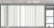
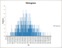
Referring to the pic below, all you do is open the CSV file (from AB) in Excel and then you will see in the top right hand corner there is an "Analyze Data" button. Click it and you will be presented with the Analyze Data options on the righthand size. You can see it is even showing a pre-packaged histogram option (frequency). You just click on that and hey presto a histogram is automatically generated for you--don't need to worry about formulas etc. See the second image below. You can do this analysis on whatever column of data you want. The Analyze Data option is a fantastic tool and allows you to do a lot of statistic analysis on your data--it's an invaluable tool. More on that tomorrow.

As a related but side issue--a very important aspect of any system is positive expectancy. You can see from the second picture below that based on the 1000 runs shown in the first figure that this system has a positive expectancy, that is none of the 1000 runs returned a negative net profit. However, if you look at the third image below AB's MC analysis certainly does not show that the same system has a positive expectancy with only around 10% of the 1000 runs returning a positive return--according to AB 90% resulted in complete capital loss. This is not because AB has some amazing way of doing MC--as I mentioned previously it is flawed.

View attachment 127833

View attachment 127834

View attachment 127835
This is crazy MA, usually i develop a system, test on a few time periods and then look at AB MC.
On results like that,i would back off.
AB is not only wrong but also very misleading.
So far after running 2h on Guppy and FB, seems ok just looking thru results but still have to go thru excel.
I did a miss of 20% of buys, via random function.will put the result of the experience on my thread.
Social life awaits before we get in lockdown too
Good stuff Frog. Very keen to read about your experience.

One of the things I mentioned in one of my prior posts on this, is that you can (to a degree) use your Excel analysis to keep a "real time" check on your systems performance with regard to live trades. Two of the key distributions I use from Excel for "real time" live trade checking is: a) the profit/loss of each live trade; and b) the consecutive number of winning/losing trades. I compare the values of these from live trades to the Excel models and anything outside 2SD gives me cause for concern and to double check my system. There is a bunch of other parameters you can use for this depending on what you consider important.
 
I think @Linus van Pelt covered everything pretty well. One downside of RT though is that it is a one-man band. If marsten was to stop, get sick and take some time off, etc., then RT wouldn't progress any further.

I know very little about the development team behind AB, but isn't AB development pretty much a one-man band as well? It is certainly not open source so I don't believe there's a true development community.
 
I know very little about the development team behind AB, but isn't AB development pretty much a one-man band as well? It is certainly not open source so I don't believe there's a true development community.

i'm actually not too sure, though I assumed there were other members of the development team. either way, AB is much more mature than RT. Though martsen has been using RT for a long time, it's only recently that he's made his software available to others for purchase.

as its been noted, AB or RT is a tool. not all tools are suited for everyone. I am still using AB, though I'm just running scripts that have been running live systems (MAP and my super strat). I will eventually port them over to RT completely. Though I find RT easier for strategy development (running a daily BO systems live from RT, and developing a futures strategy within RT as well).
 
Hi All,

This is a bit more of a follow up to my recent posts about using Excel to analyze your systems and how I use Excel.
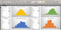
This assumes you are using the current version of Excel. Previous versions of Excel may support the following approach but I'm not 100% whether earlier versions are as straightforward. The first Excel chart below gives me all the essential information I need to know about my system in "dashboard" view and this can be easily created with a few mouse clicks and no need to manually type in complex formulas.

The the sake of this example the chart below is only showing four system metrics, but you can apply this to any system metric you like. From left to right and top to bottom the chart below shows some common system metrics: average % loss of each trade, system % drawdown, average % profit of each trade and CAR. As you can see, the Excel below contains a visual frequency distribution chart for each metric, but importantly each frequency distribution contains a statistical analysis on the left of each histogram. For me the statistical analysis contains the most important information about the associated frequency distribution. The statistical metrics I am most interested in include: mean, std error, std deviation, sample variance, min and max values, and the confidence level. I won't discuss in this post why they are important to me, but I will do that in a later post. The purpose of this post is to show you how I quickly get the below chart with a few clicks.

Excel Analysis (2).JPG

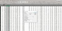
First thing is first--let's generate the statistical analysis. You need to open your raw data (this is the CSV imported from AB). Click in the "Data" menu in the top left of Excel. At this point you will see "Data Analysis" function in the top righthand corner of Excel. Click on that and you will see a detail Analysis Tool pop-up (see middle of the image below). At this stage click on the "Descriptive Statistics" option.

DS (2).JPG

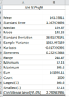
When you click on the Descriptive Statistics option you will be presented with the image below. At this point you need to select the column of data you're interested in, which in the case of this example I'm interested in column C which is the % net profit. When you select the column this should automatically transfer across to the Input Range of the Descriptive Statistics box. Make sure you tick the four options at the bottom: Summary Statistics, Confidence Level for Mean, Kth Largest and Kth Smallest. You are now all done so just click the OK button and hey presto you will get all of the statistical information shown in the first chart above. The statistical information will be placed in a new worksheet and will be in the exact same format as the first image above. Pretty easy, hey?

DS1 (2).JPG

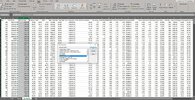
Creating the histogram chart is just as easy. Select your column of data of interest and select the home menu. As shown below, in the top right hand corner of Excel there is an Analyze Data option. Click it and in the right hand side of Excel you will be give a bunch of options, one of which is to generate a histogram. Click it and hey presto you will get a histogram chart like that show in the original diagram above.

histo (2).JPG

So that is it...you can get some really insightful information about your system with just a few clicks of a mouse in Excel.

Stay classy ASF.
 
Last edited by a moderator:
Hi All,

This is a bit more of a follow up to my recent posts about using Excel to analyze your systems and how I use Excel.
This assumes you are using the current version of Excel. Previous versions of Excel may support the following approach but I'm not 100% whether earlier versions are as straightforward. The first Excel chart below gives me all the essential information I need to know about my system in "dashboard" view and this can be easily created with a few mouse clicks and no need to manually type in complex formulas.

The the sake of this example the chart below is only showing four system metrics, but you can apply this to any system metric you like. From left to right and top to bottom the chart below shows some common system metrics: average % loss of each trade, system % drawdown, average % profit of each trade and CAR. As you can see, the Excel below contains a visual frequency distribution chart for each metric, but importantly each frequency distribution contains a statistical analysis on the left of each histogram. For me the statistical analysis contains the most important information about the associated frequency distribution. The statistical metrics I am most interested in include: mean, std error, std deviation, sample variance, min and max values, and the confidence level. I won't discuss in this post why they are important to me, but I will do that in a later post. The purpose of this post is to show you how I quickly get the below chart with a few clicks.

View attachment 127885
First thing is first--let's generate the statistical analysis. You need to open your raw data (this is the CSV imported from AB). Click in the "Data" menu in the top left of Excel. At this point you will see "Data Analysis" function in the top righthand corner of Excel. Click on that and you will see a detail Analysis Tool pop-up (see middle of the image below). At this stage click on the "Descriptive Statistics" option.

View attachment 127888

When you click on the Descriptive Statistics option you will be presented with the image below. At this point you need to select the column of data you're interested in, which in the case of this example I'm interested in column C which is the % net profit. When you select the column this should automatically transfer across to the Input Range of the Descriptive Statistics box. Make sure you tick the four options at the bottom: Summary Statistics, Confidence Level for Mean, Kth Largest and Kth Smallest. You are now all done so just click the OK button and hey presto you will get all of the statistical information shown in the first chart above. The statistical information will be placed in a new worksheet and will be in the exact same format as the first image above. Pretty easy, hey?

View attachment 127889

Creating the histogram chart is just as easy. Select your column of data of interest and select the home menu. As shown below, in the top right hand corner of Excel there is an Analyze Data option. Click it and in the right hand side of Excel you will be give a bunch of options, one of which is to generate a histogram. Click it and hey presto you will get a histogram chart like that show in the original diagram above.

View attachment 127891

So that is it...you can get some really insightful information about your system with just a few clicks of a mouse in Excel.

Stay classy ASF.
Sadly no easy way with excel2010...
 
Nice work Moving Average, and thanks again for sharing details of how you achieve and value assessing key parameters.

Qldfrog, don't panic - this stuff improves across versions but has been there for yonks - you should be able to activate the descriptive stats "Add-in" in Excel 2010 - hardest part may be just finding where the option is:

Thanks Newt, I implemented the code via formula etc but not as easy so you stick to basics, thanks for telling me about the addin
 
Glad you got it going.
Further down the list from Descriptive Statistics is "Histogram" which is what I used to create the graphics couple of days ago.

Later Excel versions do seem to make this stuff faster and more intuitive as MA has shown, but definitely still largely possible in older versions with bit of determination too.
 
Happy to see FY22 got off to a reasonable start for me. Two of my three live systems had a respectable July.

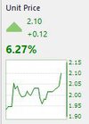
First up, my weekly put on 6.27%

Weekly July.JPG

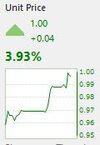
My EOD swing system put on 3.93%

Swing July.JPG

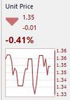
Finally, my EOD breakout gets this month's dog award having given up 0.41%

breakout july.JPG

Hopefully July is setting this scene for the run into the end of the year.

Stay classy ASF.
 
Happy to see FY22 got off to a reasonable start for me. Two of my three live systems had a respectable July.

First up, my weekly put on 6.27%

View attachment 128173

My EOD swing system put on 3.93%

View attachment 128174

Finally, my EOD breakout gets this month's dog award having given up 0.41%

View attachment 128176

Hopefully July is setting this scene for the run into the end of the year.

Stay classy ASF.
No clue how you can do this MA well done.every single day has been+xxx at 11/12 -xxx or more by the eod
 
No clue how you can do this MA well done.every single day has been+xxx at 11/12 -xxx or more by the eod
Haha...Thanks for the complement. I could simplify my effort by saying "I simply trade the system", but we all know system trading is not that simple and a lot of effort goes on in the background. I've said this before, I'm more concerned about keeping things simple and setting up my systems for consistency (ironing out the volatility) but that comes at the cost of not capturing those massive random big trades.
 
Yes - but mixture of VIX, Cum New Highs/Lows, % Stocks above MA150
No red alerts, but tighter stops for now in bumpy markets essentially for my trend following.

Glad your disversified systems are still paying.
Despite the recent sideways movement my index filter has remained on. My weekly and EOD breakout have been fully invested for some time. July didn’t see too many exits or new positions so systems have been pretty steady
 
Does anyone know which are the lowest 2 correlated stocks in the ASX200 ?
Gunnerguy
 
Does anyone know which are the lowest 2 correlated stocks in the ASX200 ?
Gunnerguy
what do you mean?lowest in price ? or lowest correlated, in that case something like GEAR VS BEAR,, should always move opposite?
as you play in the ASX
 
Top