- Joined
- 18 May 2009
- Posts
- 510
- Reactions
- 1
Below are some of the scary stats Australia has in regards to property
Referring to your graphs:
Graph 1: Debt outstanding, % of GDP
How is this graph 'scary'? All I see is most developed countries having significantly higher debt (especially private debt) compared to Australia. We're at the bottom of that list and as far as I know only a handful of those countries above us had/have severe property downturns - in fact, most are still going strong yet have 50-200% more debt than us. We also appear to have the lowest % of public debt. Sounds more like a win for us.
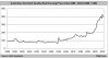
Graph 2: Debt as a Percentage of Annual Disposable Income
All this graph shows is that property became seen as an investment vehicle in the early 90s. The start of the information age gave means for your average joe blow to learn to invest in property (something that the big boys have been doing since the dawn of time) - couple that with negative gearing being introduced and we have that graph... So what? Our average debt stands at 150% of disposable income? While it's higher than the past, it's not unreasonably high for an investment - hell, I wish I could buy strong business at that rate!!!
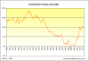
Graph 3: Net Rental Income
This one isn't as pretty, but nor is it that bad. If you borrowed 80% LVR against shares, your net income would show similar trends - your income will come in the future in the form of capital gains, the same as what people are expecting from property. So the question is, why is it ok for shares, but not for property?
Second - based on 2008-2010 the trend seems to be improving at a rapid rate. So how is this bad? Based on the trend in that graph we'll be at 2002 levels right now. Would be interesting to see recent data, but that might not paint the right picture for those presenting the information now would it?
Graph 4: Gross Yield
All this shows me, is that the yield on property has been largely consistent for the last 50 years - and that's a bad thing how? How is what happened 100 years ago relevant to the last few decades?
Do we pull up a chart of rental yields from 1400BC and bemoan that we cant get those rates today?
Graph 5: Peak to trough
This table is absolutely rubbish

Go put together a table of all stocks and show the inflation adjusted fall since the stock hit it's individual peak and present it to everyone on the forum. You watch the reaction.
-----------------------------------
Be objective in your analysis and think about what agenda the person is trying to push.
As they say: There's lies, damn lies and statistics