Australian (ASX) Stock Market Forum

Roller's Intraday futures journey

1643520182026.png
@Roller_1 the lows don't matter.

You needed to look further left. What can you see?

The blow through your lows wasn't random. What is was, was price coming through a manufactured 'retail support' level in order to mitigate a prior unmitigated demand zone.

As @Modest says - it's all in the chart. Nothing is random.

Rx1uv5Ca
 
Okay - first and foremost we must understand where we are in structure - both (candlestick and institutional) on all timeframes. This might be a long post so bear with me.

Monthly - Trend up

Cam, what the hell does a monthly chart have to do with trading the 5 minute time frame you might say - everything. All analysis should work top down. We can see here that on the long term monthly chart we are in an up trend. However, intermediary structure on the monthly has shifted bearish. What do we need to look for? We need to look for the last unmitigated down move before the up move that broke structure - marked with the blue box. This would be my longer term bearish target.

GTJ6PtKq


Weekly - Trend down

We can now refine our monthly demand zone to the down move before the up move on the weekly that has not been mitigated. You can see it marked blue in the weekly chart below. Take very careful notice that the low of that last down candle liquidated the lows of the 3 prior candles. This is the composite man liquidating all the 'dumb money' that FOMO'd into buys too early before taking price significantly higher.

y1dN7wPu


Daily - Trend down

Daily in a down trend as well. Again, we can refine our demand zone which I have done.

T7FtksqP


4 hour - Trend down

We have broken structure and the trend is clearly down here, but we have been chopping sideways. Hard to have a tradeable shorter term bias using this specific timeframe. We need more data. 1 hour chart.

Ad1kN7oA


1 hour - trend down/sideways chop

This is where things start to get exciting for me. Because the edge that we have in these markets is our understanding of institutional order flow, candlestick structure and where liquidity lies in the markets. Stanley Druckenmiller once said that 'It's liquidity that moves markets', and I didn't understand this statement for the longest time. However, once I got my head around institutional order flow and where liquidity lies in the markets that the composite man needs to target - my trading just exploded.

So what I see here is a break of structure and then liquidity being created above each of those swing highs ready for the composite man to run. On this timeframe you can see the up move before the down move that has not been mitigated is highlighted in green.

vpydPge1


30 minute

The purpose of this chart is simply to show the further refinement down to the last up move that I like. I usually only like to refine my supply and demand zones to the 30 or 60 minute charts. Keep in mind that the lower the timeframe you refine down to, the lower the probability that price will trade into it. You can also see that there is an up move above the one I have marked - however the reason I don't use it is because it has been mitigated by the up wicks of the candles in the zone I am using.

zo5sjdl9


4 minute

On this 4 minute chart you can see that we broke structure to the upside which was created by the unmitigated down move shown marked in the darker shade of blue - then what happens? Price pulls back into where? The last down move that created the new structural high on this timeframe - why? To mitigate the sell orders used by the composite man to fill their buy orders and take prices significantly higher.

What am I looking for now? The same thing. A structural break to the upside, then a pull back to the last unmitigated down move that initiated the structural break to the upside - marked in the light blue box. Here I would be looking to enter with the expectation that the composite man will then eventually want to run the liquidity points that can be seen on the 30 minute chart into the next supply zone (also on the 30 minute) before we see some kind of Wyckoff distribution schematic to take price significantly lower - where exactly? Well, firstly the structural low on the 30 or 60 minute chart and then eventually to the unmitigated demand zone marked on the daily chart.

yVGDVeow
We are up in your area Cam. i burnt my self on the way up around that first shaded box trying to fade it. Obviously didn't workout that well. Be interesting how we end up
1643602658157.png
 
1643708634816.png

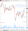
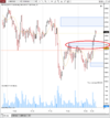
Check your chart today and notice how the box I circled had turned into support after we cleared it? Happens on every timeframe. Having these levels marked like you have (box) means you have a plan to do something if price is revisited.
 
Thanks mod, we did get a nice retest of that level on the pullback.

Big decision point here. I think if this area fails to the hold then we might be having a pull back all the way too the orange line ish.

I've been doing some dumb stuff the last week, trying to force trades and then seeing price do what I think it's going to.


1643763752608.png
 
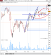
The main thing that stands out for me in that green circle is the push down before the origin of the restart of the rally up.

Another thing that I ssee there is a pivot in that area on the smaller downtrend within the larger up uptrend.

Any tips?

I tried a few times to get short yesterday morning but got burnt my first target was 27,000 but I wasn't on it when we trended down. im never patient enough i'm learning

1643771966357.png
 
Thought I would do a bit of a weekly outlook on what I think might happen over the coming week on the Nikkei. It might help align my mind with a bit of a plan for the week. I currently have a terrible addiction to shorting, it's a tough one to shake and cost me this week even though last week I said I was looking for a bounce... Like I said it's terrible

Last weekend's post I mentioned that I was looking for a bit of a bounce from a weekly demand zone that we dipped into last week.

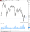
Longer term weekly trend is still up but over the last 12 months we have been in this larger range. The last three or four months have seen some lower highs being put in place and we are starting to break some more important levels to the downside.


1644114010599.png

In the daily chart below.

I think price might want to go up and test the resistance at old support around 27850. I think either we get a push straight up earlier in the week to test this area, or price pulls back to ol support and then continues higher. I think the second option is still bullish (shortterm) only if that lower level holds (down to 26500)

1644113945995.png


4hr

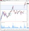
4 hour trend is trying its hardest to turn a bit more bullish from the start of the year. Putting in some higher lows on the way up to this longer term resistance area at the orange line. An important hold of the level just below 27,000 at the start of yesterday's morning session which is circled in the blue ring to keep this short term trend heading upwards.

Possibly starting to show signs of slowing up, that longer term daily resistance is the first two blue lines above current price.

1644120395131.png


60 min

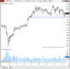
the 60 min trend is up but the pullbacks are starting to get a bit deeper and a bit less momentum when trying to come into new highs. There was a strong gap down out of that blue box just above current price which has tried to fill a few times still a little bit to go but has basically been done.

a strong open on Monday would give me more confidence that we are going to get to that higher level of resistance, whereas if we start breaking these down side levels then that box between 26500 and 26700 [longer term support] could be in trouble.

1644120919951.png
 
Looks good @Cam019 We'll see how it plays out. You got any positions on in anything ovr the weekend?

What do those colours on your chart represented?
 
Looks good @Cam019 We'll see how it plays out. You got any positions on in anything ovr the weekend?

What do those colours on your chart represented?
Na mate, not allowed to hold anything over the weekend.

It's a 'no gaps candles' indicator on TradingView. It fills in the space where markets gap with green for gap up and red for gap down.
 
Na mate, not allowed to hold anything over the weekend.

It's a 'no gaps candles' indicator on TradingView. It fills in the space where markets gap with green for gap up and red for gap down.
I thought that was it, but when I looked at my charts they are different. Ninjatrader assure me that I have my charts set up right, so I wonder what the discrepancy is.
 
Nice top down analysis Roller! Pay attention now how price reacts to your daily level you plotted. Change happens in the lower time frame. As price approaches the HTF level you should see momentum start to wane on the LTFs bt forming a distribution pattern/sideways PA.
 
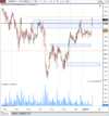
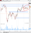
Still in this range which we have been in for awhile. Took a long this morning just after open I was hoping for a push up through that high above current price.

If price drifts down just below the orange line to around 27350 there might be a chance to get long

I wouldn't mind a impulsive move either way to clear some of this congestion.

1644367388649.png
 
Top