- Joined
- 8 March 2007
- Posts
- 3,259
- Reactions
- 4,576
AXE
Crikey! What were you thinking
I'l bet you were talking to some Fundamentalist Half Wit again
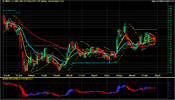
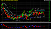
The DAILY performance suggests "UNSEAWORTY
The WEEKLY instruments suggest Lower what's left and store down below
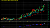

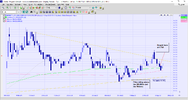
Way too much on this chart for me, it looks visually cluttered. Obviously you have trained your eye to it, I prefer to have more than one chart template each telling a particular story and then switch between them to see if the stories correlate.Please check out the MQR sail
These charts are not to be viewed as ABSTRACT artWay too much on this chart for me, it looks visually cluttered. Obviously you have trained your eye to it, I prefer to have more than one chart template each telling a particular story and then switch between them to see if the stories correlate.

What is the point of posting a chart with a lot of lines on it if you have not labeled the lines. How can anyone get any benefit from this information without knowing what the lines represent. It's difficult to see where the ship is heading when it's in stormy weather.These charts are not to be viewed as ABSTRACT art
They are more in line with the De Vinci style where each colour represents a well formulated Mathematical scenario against a black background
Of course I could do it all in Black and White but that would only be for the Colour blinded, you and your types
Please take a black and white Photostat and see if it looks better to you
Good LuckView attachment 140658
Hello and welcome to Aussie Stock Forums!
To gain full access you must register. Registration is free and takes only a few seconds to complete.
Already a member? Log in here.