Australian (ASX) Stock Market Forum

Inflation

Shipping lines carrying goods to and from Europe to Asia – which is used as a transit hub for goods coming to Australia – will need to travel south via South Africa’s Cape of Good Hope, which takes about 10 days longer if they avoid the Suez Canal.

While only about 16 per cent of Australia’s container imports come from Europe, according to Shipping Australia, an industry group that represents shipping lines, prices for some imports are expected to rise.
 
What's the metrics they based this off?
Is our population increasing significantly on top of the birth rate?
No these are just departures and arrivals only.
I belive they are based on immigration numbers from DFAT.
Obviously would not include any "unauthorised" arrivals , but don't think that small number would alter the overall figures.
Just for the record, there were 300,000 odd births in OZ in 2022, with 190,000 deaths giving a net of 110,000.
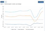
perhaps this graph gives an idea of the excess of Immigrants over emmigrants for the past ten years.
Note that the net immigration was f airly conistent before the arrival of Civd, went negative during cCovid, then doubled.
1703030464607.png
 
No these are just departures and arrivals only.
I belive they are based on immigration numbers from DFAT.
Obviously would not include any "unauthorised" arrivals , but don't think that small number would alter the overall figures.
Just for the record, there were 300,000 odd births in OZ in 2022, with 190,000 deaths giving a net of 110,000.
perhaps this graph gives an idea of the excess of Immigrants over emmigrants for the past ten years.
Note that the net immigration was f airly conistent before the arrival of Civd, went negative during cCovid, then doubled.
View attachment 167527
I wonder if it's just a constant churn of new arrivals vs visa expiry for a lot of it.
Having seen how a lot of student visa holders live. Bit of a slave class undercurrent with the whole thing.
Going cashless will have a huge negative impact on the whole scene.
 
I'm seeing plenty of spending going on and houses going under offer as soon as they hit the market, my guess is interest rates haven't peaked yet. ;)


Despite Australia having the worst inflation problem among 10 large advanced economies recently studied by The Economist, the RBA’s internationally modest 4.35 per cent cash rate is inexplicably only 55 basis points above its neutral estimate.
 
Bit of a slave class undercurrent with the whole thing.
More than a bit. I can't think of a working class job (I'm not counting trades as working class any more) I've hired someone to do in years that I didn't have a migrant show up to do.

Carpet cleaner - chinese
"Regular" cleaners - filipino
Detail car - indian
Build a fence - indian
Sandwich at subway - bangladeshi
Bag groceries - indian

Pour a concrete slab or whatever were all aussie guys but any "grunt" type job is almost entirely migrant now.
 
Generally, the two data sets largely follow each other, with the arrivals spikes generally lagging the departure spikes.
Looking at that chart, think it's including tourism both foreigners visiting Australia and Australians going on holiday overseas. Hence the lag between departure spike and arrival spike and the clear seasonality with same pattern each year.

What really matter is those living here or at least visitors on a working visa. Ordinary tourists staying in hotels or in an already occupied house (eg with family) aren't really going to add to demand or supply outside the tourism and hospitality sector plus incidentals (utilities etc). Very different if their "hotel" is in fact a house / apartment that could be permanently occupied or if they're working whilst here. :2twocents
 
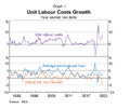
Back in November , there was a bit of discussion on this forum re the levels of productivity or lack thereof in OZ.
The RBA released figures on productvity per hour worked show a decline in the last two years.

View attachment 168103
Mick
Hi Mick, reading the same graphic, I would say check Covid aberration and it is clear productivity has fallen since so more 3 years of fall, enable to ever catch up pre Covid..
Working from home not that efficient plus people giving up after Covid rules and regulation
 
Hi Mick, reading the same graphic, I would say check Covid aberration and it is clear productivity has fallen since so more 3 years of fall, enable to ever catch up pre Covid..
Working from home not that efficient plus people giving up after Covid rules and regulation
i would have suggested decreased loyalty to the employer as folks are forced to go for second and third jobs ( or side-hustles ) add in the prospect of job losses , and increased use of robots in the work-place , and i think that trend will continue from a fair while
 
There have been a number of posts both on ASF and elsewhere over recent times highlighting how Immigration is contributing to inflation.
I would have certainly agreed with those sentiments until I started looking at the ABS stats on immigration.
Below is a chart of the numbers entering the country versus those leaving.
View attachment 167465

Generally, the two data sets largely follow each other, with the arrivals spikes generally lagging the departure spikes.
The last few months have continued that trend, however the spikes in inward migration were bigger than outward migration
We need to see a few more months of data to see if it is indeed a new trend.
Perhaps the immigration is causing inflation/housing bubble/labour oversupply etc needs a little further data analysis.
mick
That chart isn’t showing immigration, it’s showing all arrivals and departures, eg tourists and travellers.

You aren’t going to be able to see 200,000 annual immigration on that chart when it’s showing a million plus per month tourists.
 
What's the metrics they based this off?
Is our population increasing significantly on top of the birth rate?
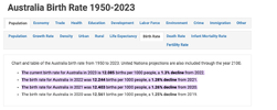
Australia’s birth rate doesn’t really maintain the population, population growth now relies on immigration and to a smaller extent a slowly increasing life expectancy/ageing population.

For a population to grow naturally you need a birth rate of more than 2 births per woman, we are less than one here.
 
If you are going to quote statistics, at least get it right and quote your source.
View attachment 168109

Mick
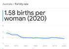
Yeah, I meant to say less than two, but I had the 1.5 figure in my head because I had just fact checked it before posting, I am not sure why I wrote one, just a typo I guess. It’s been something I have been thinking about for a while.

Either way, my point remains, Australian birth rates are not creating population growth, only reason we are growing is immigration.

It’s a fact in pretty much most of the developed world, the global birth rate is about 2.3 or 2.5 depending on source, because it’s propped up by Africa and the Middle East. so most developed nations that want to maintain their population will require immigrants from the nations with higher birth rates.

IMG_0102.jpeg
 
Yeah, I meant to say less than two, but I had the 1.5 figure in my head because I had just fact checked it before posting, I am not sure why I wrote one, just a typo I guess. It’s been something I have been thinking about for a while.

Either way, my point remains, Australian birth rates are not creating population growth, only reason we are growing is immigration.

It’s a fact in pretty much most of the developed world, the global birth rate is about 2.3 or 2.5 depending on source, because it’s propped up by Africa and the Middle East. so most developed nations that want to maintain their population will require immigrants from the nations with higher birth rates.

View attachment 168110
I think I was asking if our population was increasing year on year significantly as the chart seemed to show it being an equal exchange of in/out.
I'm too hung over to scroll back.
 
I think I was asking if our population was increasing year on year significantly as the chart seemed to show it being an equal exchange of in/out.
I'm too hung over to scroll back.
The chart Mullo put up is not a population or immigration chart, it’s just a chart showing numbers people entering and leaving Australia most of whom are tourists.

You tell that straight away because it’s showing over 1 Million people coming and going each month. There is no way you will be able to make out the 15,000 or so immigrants arriving each month using that chart.

I am not sure Mullo understood the chart.

But yes, our population does increase each month. We have more immigrants arriving than we need to cover our own shrinking population.
 
Top