Value Collector
Have courage, and be kind.
- Joined
- 13 January 2014
- Posts
- 12,281
- Reactions
- 8,555
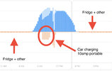
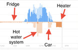
Here is a graph of my personal solar production and usage, Blue is solar production and orange my electricity usage.
I was away when this was happening but you can see very little demand all day because it was just my fridge and other minor things on, but you can see two big spikes in usage first is the car charging at 9am, and second in the hot water system switching on at 11am.
The reason I have my car and hot water set up to charge during the day is to make the most of my solar, my production exports are limited to 5kW/h, so if I am not using anything during the day my production is idled back to 5kW/h, you can see the flat spot in the graph once the hot water system stops, (dark blue Is exports, light blue is production I used myself)


