Now, you pro fluoride 'professionals' seem very lacking in the ability to post charts and diagrams with analysis to support your arguement.
Yes, we tend to rely on research, not just pretty diagrams. Because we are capable enough to understand research, so we may as well use it in forming our opinions instead of just using propaganda, hearsay, news articles, pretty pictures, and biased stuff.
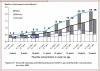
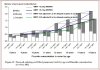
The lines you drew represent gradients, i.e rates of change of missing teeth (if you straighten them). Refer to Maths 101 for more info. The gradient in the blue line is greater than the lower line. This means the rate of losing teeth is greater in non-fluoridated towns (blue line) than in fluoridated towns …surprise surprise!!To start with tell me what you make of the spread between the two lines on the other chart.
It’s all very simple whiskers. That’s the beauty of these graphs. Problem with you is you read into it too much and try to come up with fancy anti-fluoridist reasons to post up here which never make any sense anyway.
Could be due to any number of reasons (including statistical variation) if you are referring to it in isolation. Refer to statistics 101. But tell us your reasons for it.To start with tell me what you make of the blue circle.