Australian (ASX) Stock Market Forum

Reversal Swing Convergence Divergence

Joined
2 August 2010
Posts
39
Reactions
0
Hi Guys,

I've started running analysis on the RSCD method on a few various
ASX ticker threads however thought I would open a thread here for
questions and basically as a platform to reference the various
charts i've analysed. Mods - If any problems with this please let
me know. I'm new to this particular forum however have posted on a few other forums BB's in the past however was looking for a new 'home' :)

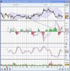
As a intro the RSCD method is a way of trading in volatile markets
as a way of choosing vital entry points before or during breakouts
or short term periods of SP gain. It also shows possible exit
points and weakness in the SP that you would not pickup during
normal analysis. You could describe this method as 'Swing trading'
however the main emphasis is on the RCD chart - A kind of MACD chart
designed for these swing plays. The plays are PURELY T/A and any
fundamental research is minimal. I do however run a quick reference
check on the ASX code to find any possible red flags.

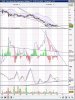
To start off I have posted a couple of charts with full analysis on the method and update as the charts play out. These have been posted within the actual ASX Code threads with charts attached.

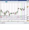
OGC - Comparison of recent swings and short term view
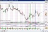
DJS - Overall daily chart analysis and RCD direction (closed)
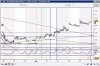
DUE - analysis on RCD patterns and potential future direction.

As mentioned in the DJS thread I do not want to be needing to follow
the F/A on each stock and DJS gives us a good example. Because of
the potential court action I sold straight out and will find another
stock with less F/A emphasis.

Happy to field any questions or discuss the method.

Thanks for having me ASFers & mods!

-
eunza
 
nice! Had seen your earlier posts before and thought they looked interesting.

Looking forward to seeing a bit more:)
 
Thanks Professor_Frink :)

I've just posted a daily comparison chart of SGN in its own thread analyzing the current action compared to similarities on recent price increases.
 
Thanks Professor_Frink :)

I've just posted a daily comparison chart of SGN in its own thread analyzing the current action compared to similarities on recent price increases.

RCD (middle chart) - check the comparisons of the blue and green trend channels - as mentioned earlier a downward pink trend above the Centre line will be neutral whereas under the centre line will be bullish - You can see the SP start to run up as the pink draws down at the start of the blue section and again when it renters mid may.
just before the green section starts you can see the several attempts to close below the line - when this does finally happen the SP begins to rise.
The RCD has also been held back at the short green line showing a double top and return to trending downwards below the centre line.
The final indicator is the drop below the lower green trend line - This can show that the RCD is picking up speed (bullish)

RSI (lower chart) The shading we are looking for is the dark blue. Note the trend of the blue sectioned compared with the trend on the Green.
The blue section rose consistently on its trend channel and when it faltered below the support you can see the resulting SP drop in mid june
On the green section we've just recently bounced off the support line for the 3rd time - and the current direction is a strong uptrend. (stronger than the last) It has also spiked up to the high of the first bounce.

Volume - Currently this is probably under the radar of most systems so we don't see much Volume increase yet- however due to the low risk of downside (that is the RCD confirmation) these plays are good to enter early.

So in overview - Strong RCD level, Strong RSI, minimal current volume and early signs of SP breakout.

Oh dear.

Hindsite analysis at its peak!
Do you have any trading figures on your "idea"
Any expectancy---string of losses---string of wins?

Can you explain point of entry with the method for any new trades.
Are 2 divergence peaks enough.
How do you define when the second peak is in its place---hard to do as it is dynamic.

careful tech you'll scare off all the new posters to the forum with confrontational comments like that:D

We've all been guilty of posting late on occasions when it comes to trades, though I'm failing to see how this qualifies, there isn't even an entry point highlighted in his post, seemed to be a case of suggesting higher prices and nothing more.

Having said that, I do agree with your sentiment about identifying peaks and troughs for divergence plays, it's a lot tougher in real time than it looks.

Would be interested in hearing your thoughts on this eunza:)
 
Oh dear.

Hindsite analysis at its peak!
Do you have any trading figures on your "idea"
Any expectancy---string of losses---string of wins?

Can you explain point of entry with the method for any new trades.
Are 2 divergence peaks enough.
How do you define when the second peak is in its place---hard to do as it is dynamic.

Hi Tech/A

The point of entry method that I would use for these kind of trades would be to first of all to analyze the Longer Term Charts (such as weekly / Daily) which give a cleaner snapshot of the past performance on the chart - when I've decided that an entry could be 'positive' i'll then drill down to smaller points in time (such as 30min / 1 hr) and pick a swing when I see a good opportunity. I haven't said that I can predict what the future will hold - just the probabilities that I see (this I admit is very subjective however you can't just use a rigid system) and study the chart on what has happened and what MIGHT happen.

As to the expectancy and results from my back testing (run over about 2 dozen ASX Codes over 5 years - and also others more recently on last 2 years and 6 months data to keep up with the market volatility ) I've found that losses seem to be minimal when they occur (on avg about 2-3%) as i'll sell out when the indicators line up - and with profits they run out to about 8-15% (seems to be around 1/4 of trades however will ebb and flow). overall I've had quite positive results.

Re: the divergence peaks - any chump can draw a line between 2 points - However you can still use whatever data available - obviously the more better the results.

Re: dynamic data - I'll only use these as a guide. Of course these can change until the 'close' of the candle however you can still approximate until then.

Not sure why the hostility on this board but all I'm doing is analyzing the charts as I see them and trying to pick more % of winners than of losers. Thats how i see it - a % game.

As Professor_frink mentioned - I haven't listed entry points as its more of a general direction

Eunza,
Just regarding the % game you mentioned are you referring to % in amount won to amount lost, or number of winners to number of losers?

There is no hostility, but historically on this forum some will deride lagging indicators. My take is they haven't yet understood the real value of them. Is there any chance you can make your charts easier to read with less noise?
 
Ok i've updated DUE and SGN - Will update DUE on Monday.

happy to lay my cards on the table here - Tech/A i've done plenty of back testing - lets see from the results as they go as although i'm not stating entry/exit points i'm still showing bullish/bearish on my posts (all bullish so far however will post the bearish when they show up.) I might start at least showing on the chart where i've made the 'call'

still happy to take the criticism but lets just see how it goes :)
 
Ok ii've updated DUE and SGN - Will update DUE on Monday.

happy to lay my cards on the table here - Tech/A i've done plenty of back testing - lets see from the results as they go as although i'm not stating entry/exit points i'm still showing bullish/bearish on my posts (all bullish so far however will post the bearish when they show up.) I might start at least showing on the chart where i've made the 'call'

still happy to take the criticism but lets just see how it goes :)

Great stuff.

Can you whack up a chart on both please.
I think it important to have an entry point otherwise all that's being shown is a possible setup.
Unless of course your saying that your divergences are a precursor to another entry triggered by some other condition?

I also think its important to know when the signal no longer valid---in other words the divergence is no longer applicable as a setup---IE its failed.
On the flip side when you would take profit.
Any stop?

Not hard to post up and then follow.

Shouldn't be an issue for adding approx entry / exit periods on the charts - (ie for my prior posts (in sgn, ogc etc) with charts you could consider the time of each thread posting would be the last traded price I guess. Was thinking probably will mark on a short term (15 min , 1hr or whatever) so at least will be trackable. Don't have a chance today however if time permits on Monday will update existing charts with the point in time that each prior post was made and then in future posts mark points on the latest live charts.

Although I do use price stops (sometimes up to 5%) my stops are generally based more on the levels / momentum of Indicators themselves and do need quite a level of micromanagement. This is all done manually instead of programmed charting S/W.

Also planning on showing failure of support lines / failures when they occur - Exits are usually only enforced on 2 / 4 hr or longer time periods (too much static on shorter periods and othewise will exit prematurely each time)- Although sometimes if the chart is looking very ominous short term i'll exit and look for another entry when conditions look to improve.
 
Ok - So i've placed a few posts on the RSCD analysis on SGN, OGC and DUE for the last week or so.

As a way of approximately tracking when and where the hypothetical entries / holds or exits are i've added vertical lines for BUY (green), HOLD (Blue) and will use red for any possible exits. (none as yet)

Any discrepencies on the charts with times etc let me know.

Again these entry and exit Posts are PURELY HYPOTHETICIAL for the purpose of the RSCD discussion.
 

Attachments

  • SGN09081hr.JPG
    SGN09081hr.JPG
    87.4 KB · Views: 6
  • due09081hr.JPG
    due09081hr.JPG
    94.2 KB · Views: 3
  • OGC090815min.JPG
    OGC090815min.JPG
    96.6 KB · Views: 3
Thanks Eunza.
What I do note and wish to point out in all charts thrown up (including ALL) is there are many cases shown on the charts where there is divergence which has both succeeded and failed.
The addition of filters is an attempt to increase the reliability of an indicator which is often giving signals which equate to very little.

I note that Sinner sees a pullback within an up move as a successful divergence trade.(There are also some un successful ones on the charts presented.)

Pitty we dont have more than Eunzas charts to consider.

Hi Tech/A - The charts that I have posted today are shorter time charts - 30min / 2hr etc - This is just so I can easily insert the entry exit points.

However I do switch between timelines quite consistently. The shorter time lines are almost impossible to trade on their own -

If you compare the 1 day / 2day / 1 week charts RCD results to the shorter intraday charts these shorter ones show alot more movement that are cleaned / smoothed when set in a longer time frame. Usually the longer periods are more reliable however you want to also see the short term picture. (and so you don't have to wait until the candle closes)
 
Yes I understand.
It does happen regularly on all timeframes.
But agree longer timeframes tend to have a larger footprint and as such eliminate some noise.
 
Hi Guys,

A few updates for today - each subsequent ASX Code has been posted in the appropriate thread.

DUE - looking bearish.
OGC - looking a little mixed - might be a possible reentry on short term strength
SGN - Looking very strong on intraday, daily and weekly (will post a screen of the weekly soon if i get a chance)
 
posted a few updates:

SGN - looking weak on daily
PEN - still looking strong
WAN - just popped up on my radar - looks good for a short term trade however have attached here as no thread exists. Looks to be breaking out on price from consolidated low and showing a convincing break also through the RCD (RSI also looking good)
 

Attachments

  • WAN1608-30min.JPG
    WAN1608-30min.JPG
    121 KB · Views: 7
Been out of action for the last week -

Anyway back to it:

I've posted an update in 'PEN' - This is looking very strong at the moment.

Also on WAN:

Still a hold - Was showing slight weakness on the RCD last week however the bearish direction was halted (arrow) and we have a continuation of bullish trend - this will need to be confirmed however of the next few days.
 

Attachments

  • wan4hr.JPG
    wan4hr.JPG
    127 KB · Views: 2
Top