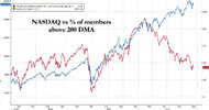
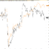
I'm trying to understand the calculation of the XJO compared to the individual stock prices it represents. (I realise it is weighted by market capitalisation)
XJO rarely gaps up or down overnight, but the individual stocks do gap a lot. Once these stock gap down, it takes a long time (relatively) for XJO to catch up.
Case in point was the open on the 31st July. I reviewed the largest 20 stocks from XJO on the 31st July (which represent 50% of XJO capitalisation), and these collectively gapped down 1% on market open. XJO did not gap down, and then took a full 10 minutes to show this 1% move.
So it seems to me that XJO is very slow at recalculating the correct index value.
Is my understanding correct or have I missed something here?
Appreciate any insights!


