over9k
So I didn't tell my wife, but I...
- Joined
- 12 June 2020
- Posts
- 5,226
- Reactions
- 7,318
Ok so the purpose of this thread is to enable any total newbie to stock trading to understand the basic information being communicated in the most common stock charts used/seen in the business and then also read and understand (or, make sense of) the information being communicated in them and the jargon used to refer to that information.
To put things another way, stock charts are simply a graphical version of a verbal statement/communication and vice-versa (read that again, make sure you understand that I am saying that you can communicate the exact same information in a graphical form as you can verbally) and by the end of this guide I hope to have taught you how to translate between the two.
Before I begin doing that however there are three golden rules to chart analysis/mathematical trading that you MUST keep in mind, always. NEVER forget these three things:
1. Mathematical/algorithmic/quantitative trading is NOT valid outside of normal market conditions.
This is not to say that quantitative analysis cannot be of any assistance when markets are in unusual conditions, but in order for a mathematical model to work there are certain conditions which have to remain the same between its model of the past and its projection into the future.
The more those conditions change (the more unusual the conditions are), the more invalid/less useful the modelling becomes.
If things change enough, the entire model is completely invalidated, and I can prove it to you.
I wrote this following piece for a systems theory unit I did at uni a few years back. It’s a bit long, but it’s important that you read it because this is a point that cannot be overstated.
I am drumming this into you for a reason.
"In 1970s academia, mathematicians and economists were looking for a way to try to quantify financial events, i.e markets. Their physicist cousins knew that particles in liquids and gases move or shake without any apparent cause, and this was a sign of the existence of molecules and atoms whose erratic movements caused the motion – i.e particles bounce around and into one another.
In the 1900s, physicists like Einstein, with his general theory of relativity, had explained how this motion worked. They found that particles moved randomly, but they could model the most likely paths that something which collided with these randomly moving particles would follow.
So mathematicians and economists attempted to apply this formula and adopted a “naturalistic” view of the stock market. Roger Lowenstein (2011) has even stated that he and other students would “go to the physics library looking for concepts we could jam into finance”.
In its first iteration, Black and Scholes developed a formula for pricing options based on the Capital Asset Pricing Model, but its use was limited as it only applied for a given moment in time. They were still left with the dilemma of developing a formula that worked over continuing time.
It fell to a young PhD candidate at MIT by the name of Robert Merton to figure that out. Merton took a formula from rocket science that calculated launch trajectories and their change with time and then integrated this with Black & Scholes’ formula. This alternative approach showed that the option prices derived by Black and Scholes held up under considerably more robust assumptions than those in their original work because it could factor in time being a continuing thing rather than just at a fixed point.
The website “Priceonomics” explains how the formula works:
“If movements in the stock market are random, they can be modeled and managed. This is what Black-Scholes does. The formula does not try to predict how stock prices will change. Instead it assumes the future path of stocks’ prices will—just like the dust mite buffeted by atoms and molecules—follow a normal distribution, which means that small movements are much more likely than extreme movements”.
So with this formula, the only variable needed to understand the normal distribution (the probability that a stock’s price will change by such and such an amount) is the stock’s volatility. By looking at the stock’s volatility in the past, the Black-Scholes formula can model how a stock price may change and determine the right price for an option.
(For the more advanced reading this, it is “simply” the formula used to derive the options greeks)
This was actually initially rejected by the finance industry when it was developed in 1973. Traders at the time were very skeptical about the notion of completely quantifying the billions of separate interactions that made up an option, not to mention how absurdly difficult the calculations actually are - there is a reason investment firms have to hire rocket scientists to actually do them.
So the “quants” (as they became known) like Salomon Brothers’ John Meriwether that could actually do the calculations were almost exclusively given research positions within investment firms, and kept out of harm’s way.
But after 20 years of resistance and caution, the incredible predicting power of the formula and its ability to make money became undeniable, and in 1994, “the quants” got their own hedge fund.
In 1994, Meriwether started the now infamous hedge fund “Long-Term Capital Management”, and many of his colleagues from Salomon Brothers left with him.
He was “staggeringly ambitious” (Lowenstein, 2001). He demanded investors commit their money and be unable to withdraw it, no matter the losses, for 3 years. With fees of 25% of profits (in addition to fees of 2% of the assets under management) compared to the industry’s normal 20%. And wanted the original developers of the formula to join him at the firm.
He also wanted a total of two and a half billion dollars from his investors.
And he actually got most of it. Robert Merton and Myron Scholes, whose work on the Black-Scholes formula made them both rumored candidates for the Nobel Prize, joined as advisors. He got 1.5 of the 2.5 billion dollars he wanted, and he got it under the terms he demanded.
“The nerds’ day had come”. (Lewis, 1999)
You can see the appeal of this – the developers of the formula itself collaborating with those who had, so far, very successfully put it into practice. One of the investors is on record describing Myron’s grasp of financial mathematics as what was used to “Blow investors away”. (Lowenstein, 2001)
This was the ultimate test, and it was tremendously successful.
In 1994, its first year, Meriwether and his traders yielded 28%. In the next year it was a yield of 59%. In the third it was 57%, and Scholes and Merton were subsequently awarded the Nobel Prize in Mathematics. These were numbers unheard of in investing.
And everyone else quickly realized this. Other firms very quickly started raiding everywhere they could think of - academia, NASA, everywhere they thought they could find someone smart enough to perform the immensely difficult calculations necessary to accurately model financial markets with this formula, and paid the maths geniuses or the rocket scientists or whoever they managed to get huge salaries to perform these financial calculations for them. The speed of adoption was unparalleled. Texas instruments even created a specialized hand-held calculator precisely for using the formula.
Meriweather negotiated access to big banks’ capital on unprecedentedly friendly terms. Everyone wanted a slice of the action. “It was generally believed that Long-Term had the benefit of superior, virtually fail-safe technology” (Lowenstein, 2001).
But there is one fatal flaw with this – the formula only works under normal market conditions. Like the rocket taking off, you cannot calculate a trajectory when some other factor influences it. A calculation of a launch trajectory would become completely invalid if part of the rocket fell off or something for example. And because this is unforeseeable, it cannot be factored in – if it could be, it would have to first be foreseeable.
So everything was going gangbusters and the firm was levered up to the hilt and making a fortune from it, which only allowed them to borrow more. And with them ploughing their previous profits back into the firm as well, this simply ensured that if they fell, they would fall hard.
Of course, with the success of the formula so far you can forgive them for what they were doing – it was as if it had given them the ability to turn the market transparent.
And then the Asian crisis hit.
“The firm had bet that volatility would be low and that the premiums for low-risk assets (like brand new Treasury bonds) would lessen. Instead the opposite happened: Investors worried about a global downturn fled to safety. In some months, the firm only broke even, and Long-Term Capital had its lowest returns yet on the year.
Yet Meriwether and co. did not panic. While other investors got out of their positions, Long-Term Capital doubled down. The traders believed the Asian Crisis was an opportunity, just like Black Monday in 1987. They expected the market would calm eventually; in the meantime, investors' flight to safety was the exact type of inefficiency and stupidity they exploited.
But the Asian Crisis kept getting worse, and the market kept getting more erratic and volatile. Unprecedented events kept occurring: It was an article of faith among investors that Russia, a nuclear superpower, would not default. But then the Russian government decided that it preferred to pay Russian workers rather than bondholders, defaulted, and the International Monetary Fund decided not to come to the rescue.
The markets panicked. As investors bought safe assets, the fund’s trades looked worse and worse. In one day, the firm lost $553 million”. (Lewis, 1999)
By the time the dust settled, the firm had been completely wiped out, and they weren’t the only ones – as I showed earlier, everyone else in the business had essentially seen their success and just copied them by this point, so the entire market was levered up to the hilt. In five weeks, over a trillion dollars of losses had accumulated across the industry, all because they stuck with using the formula as if it was a law (like part of it is in physics) instead of an imperfect predictor, and ignored what their intuition was telling them.
Traders learned their lesson in trying to make an absolute quantification of human activity, i.e a predictive law rather than likelihood. Nowadays, traders see the formula as just one of many tools to use in a toolkit for risk appraisal, one which includes their own intuition about what’s going on in the market and whether things are “normal”.
The abstract of Ogilvy’s Systems Theory: Arrogant and Humble states the following:
“Arrogant systems thinkers aspire to a totalizing grasp of the whole. Humble systems thinkers start from the same premise of interconnectedness, but recoil from totalization”.
It is clear that if we are going to try & take an approach from the natural sciences where formulas of systems are developed as laws, and apply it elsewhere, then we absolutely need to take a humble systems approach and use it as just one tool of a multi-faceted approach to whatever we are doing, not a revolutionary paradigm shift.
A trillion dollars tells us why".
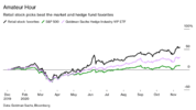
For a more modern example I can demonstrate, we need look no further than the coronavirus pandemic because we actually now have cold hard data on how retail traders (which aren’t rocket scientists capable of doing absurdly complex financial mathematics) have fared vs the hedge funds, and it’s not even a comparison:
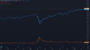
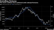
However, this is data just for the hedge funds as a whole. Why don’t we take a look at the quantitative funds specifically:
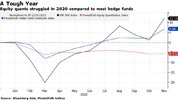
As you can see, the quantitative funds have not even matched the market throughout this period. They have actually lost money in a bull (increasing) market.
That’s right, they have made less money than if you had simply parked all of your money in an index-tracking ETF like SPY, walked away, and not made a single trade.
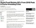
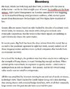
But the news for the quantitative funds actually gets even worse. Several of them are on the brink of bankruptcy due to their dogged refusal to admit that their trading method simply isn’t valid under these conditions:
Mathematical trading methods are not valid outside of normal market conditions.
2. Chart reading is not an exact science
All chart reading, mathematical modelling, quantitative trading and so forth is an approximation. Even objective, precise calculations like correlations do not imply any link between to sets of data (or data points) whatsoever. Chart reading is simply the art (and it is an art) of identifying how a stock is behaving and estimating when to buy and/or sell it.
3. Chart reading is subject to a lot of trading psychology
There is a saying in medicine that goes “If you hear hooves, you think horses, not zebras”. What this statement is implying is that if you are looking for a reason to believe something, you will be able to find one. If you are looking for evidence of there being a zebra in the vicinity and you hear hooves, then you will have your “proof” when the reality is that outside of a zoo or actual zebra habitat, it is about a billion times more likely to be a horse that you are hearing, not a zebra.
In chart reading, this takes the form of false positives. I.e seeing something you want to see. This is also known as confirmation bias.
I guarantee you that if you look at the chart of almost any stock, at any time, for long enough, you will be able to see some kind of pattern. This does not necessarily mean you have actually identified some kind of trend.
It is far, far, far more likely that the movements of the stock have simply coincided with something that you are TRYING to see (a pattern) rather than any kind of actual trend developing. In other words, if you are TRYING to find a pattern, you will probably find one, but that doesn’t mean you’ve actually identified anything at all.
The first thing you must do when you think you have identified some kind of trend is to ask yourself why the stock might (because you aren’t sure it’s following any kind of trend at all yet) be following the trend that you think you have identified and then work your way out from there.
You won’t have to lose your money many times before you start getting very honest with yourself very quickly as to whether you’re actually identifying trends vs just seeing a trend (money making opportunity) when you want to see one.
This becomes particularly so when your first couple of trades make you money and your next ten lose it. Did you actually identify a trend in the first two trades or did you just get lucky?
There is nothing more dangerous than overconfidence.
So with all of that said, let's begin.
To put things another way, stock charts are simply a graphical version of a verbal statement/communication and vice-versa (read that again, make sure you understand that I am saying that you can communicate the exact same information in a graphical form as you can verbally) and by the end of this guide I hope to have taught you how to translate between the two.
Before I begin doing that however there are three golden rules to chart analysis/mathematical trading that you MUST keep in mind, always. NEVER forget these three things:
1. Mathematical/algorithmic/quantitative trading is NOT valid outside of normal market conditions.
This is not to say that quantitative analysis cannot be of any assistance when markets are in unusual conditions, but in order for a mathematical model to work there are certain conditions which have to remain the same between its model of the past and its projection into the future.
The more those conditions change (the more unusual the conditions are), the more invalid/less useful the modelling becomes.
If things change enough, the entire model is completely invalidated, and I can prove it to you.
I wrote this following piece for a systems theory unit I did at uni a few years back. It’s a bit long, but it’s important that you read it because this is a point that cannot be overstated.
I am drumming this into you for a reason.
"In 1970s academia, mathematicians and economists were looking for a way to try to quantify financial events, i.e markets. Their physicist cousins knew that particles in liquids and gases move or shake without any apparent cause, and this was a sign of the existence of molecules and atoms whose erratic movements caused the motion – i.e particles bounce around and into one another.
In the 1900s, physicists like Einstein, with his general theory of relativity, had explained how this motion worked. They found that particles moved randomly, but they could model the most likely paths that something which collided with these randomly moving particles would follow.
So mathematicians and economists attempted to apply this formula and adopted a “naturalistic” view of the stock market. Roger Lowenstein (2011) has even stated that he and other students would “go to the physics library looking for concepts we could jam into finance”.
In its first iteration, Black and Scholes developed a formula for pricing options based on the Capital Asset Pricing Model, but its use was limited as it only applied for a given moment in time. They were still left with the dilemma of developing a formula that worked over continuing time.
It fell to a young PhD candidate at MIT by the name of Robert Merton to figure that out. Merton took a formula from rocket science that calculated launch trajectories and their change with time and then integrated this with Black & Scholes’ formula. This alternative approach showed that the option prices derived by Black and Scholes held up under considerably more robust assumptions than those in their original work because it could factor in time being a continuing thing rather than just at a fixed point.
The website “Priceonomics” explains how the formula works:
“If movements in the stock market are random, they can be modeled and managed. This is what Black-Scholes does. The formula does not try to predict how stock prices will change. Instead it assumes the future path of stocks’ prices will—just like the dust mite buffeted by atoms and molecules—follow a normal distribution, which means that small movements are much more likely than extreme movements”.
So with this formula, the only variable needed to understand the normal distribution (the probability that a stock’s price will change by such and such an amount) is the stock’s volatility. By looking at the stock’s volatility in the past, the Black-Scholes formula can model how a stock price may change and determine the right price for an option.
(For the more advanced reading this, it is “simply” the formula used to derive the options greeks)
This was actually initially rejected by the finance industry when it was developed in 1973. Traders at the time were very skeptical about the notion of completely quantifying the billions of separate interactions that made up an option, not to mention how absurdly difficult the calculations actually are - there is a reason investment firms have to hire rocket scientists to actually do them.
So the “quants” (as they became known) like Salomon Brothers’ John Meriwether that could actually do the calculations were almost exclusively given research positions within investment firms, and kept out of harm’s way.
But after 20 years of resistance and caution, the incredible predicting power of the formula and its ability to make money became undeniable, and in 1994, “the quants” got their own hedge fund.
In 1994, Meriwether started the now infamous hedge fund “Long-Term Capital Management”, and many of his colleagues from Salomon Brothers left with him.
He was “staggeringly ambitious” (Lowenstein, 2001). He demanded investors commit their money and be unable to withdraw it, no matter the losses, for 3 years. With fees of 25% of profits (in addition to fees of 2% of the assets under management) compared to the industry’s normal 20%. And wanted the original developers of the formula to join him at the firm.
He also wanted a total of two and a half billion dollars from his investors.
And he actually got most of it. Robert Merton and Myron Scholes, whose work on the Black-Scholes formula made them both rumored candidates for the Nobel Prize, joined as advisors. He got 1.5 of the 2.5 billion dollars he wanted, and he got it under the terms he demanded.
“The nerds’ day had come”. (Lewis, 1999)
You can see the appeal of this – the developers of the formula itself collaborating with those who had, so far, very successfully put it into practice. One of the investors is on record describing Myron’s grasp of financial mathematics as what was used to “Blow investors away”. (Lowenstein, 2001)
This was the ultimate test, and it was tremendously successful.
In 1994, its first year, Meriwether and his traders yielded 28%. In the next year it was a yield of 59%. In the third it was 57%, and Scholes and Merton were subsequently awarded the Nobel Prize in Mathematics. These were numbers unheard of in investing.
And everyone else quickly realized this. Other firms very quickly started raiding everywhere they could think of - academia, NASA, everywhere they thought they could find someone smart enough to perform the immensely difficult calculations necessary to accurately model financial markets with this formula, and paid the maths geniuses or the rocket scientists or whoever they managed to get huge salaries to perform these financial calculations for them. The speed of adoption was unparalleled. Texas instruments even created a specialized hand-held calculator precisely for using the formula.
Meriweather negotiated access to big banks’ capital on unprecedentedly friendly terms. Everyone wanted a slice of the action. “It was generally believed that Long-Term had the benefit of superior, virtually fail-safe technology” (Lowenstein, 2001).
But there is one fatal flaw with this – the formula only works under normal market conditions. Like the rocket taking off, you cannot calculate a trajectory when some other factor influences it. A calculation of a launch trajectory would become completely invalid if part of the rocket fell off or something for example. And because this is unforeseeable, it cannot be factored in – if it could be, it would have to first be foreseeable.
So everything was going gangbusters and the firm was levered up to the hilt and making a fortune from it, which only allowed them to borrow more. And with them ploughing their previous profits back into the firm as well, this simply ensured that if they fell, they would fall hard.
Of course, with the success of the formula so far you can forgive them for what they were doing – it was as if it had given them the ability to turn the market transparent.
And then the Asian crisis hit.
“The firm had bet that volatility would be low and that the premiums for low-risk assets (like brand new Treasury bonds) would lessen. Instead the opposite happened: Investors worried about a global downturn fled to safety. In some months, the firm only broke even, and Long-Term Capital had its lowest returns yet on the year.
Yet Meriwether and co. did not panic. While other investors got out of their positions, Long-Term Capital doubled down. The traders believed the Asian Crisis was an opportunity, just like Black Monday in 1987. They expected the market would calm eventually; in the meantime, investors' flight to safety was the exact type of inefficiency and stupidity they exploited.
But the Asian Crisis kept getting worse, and the market kept getting more erratic and volatile. Unprecedented events kept occurring: It was an article of faith among investors that Russia, a nuclear superpower, would not default. But then the Russian government decided that it preferred to pay Russian workers rather than bondholders, defaulted, and the International Monetary Fund decided not to come to the rescue.
The markets panicked. As investors bought safe assets, the fund’s trades looked worse and worse. In one day, the firm lost $553 million”. (Lewis, 1999)
By the time the dust settled, the firm had been completely wiped out, and they weren’t the only ones – as I showed earlier, everyone else in the business had essentially seen their success and just copied them by this point, so the entire market was levered up to the hilt. In five weeks, over a trillion dollars of losses had accumulated across the industry, all because they stuck with using the formula as if it was a law (like part of it is in physics) instead of an imperfect predictor, and ignored what their intuition was telling them.
Traders learned their lesson in trying to make an absolute quantification of human activity, i.e a predictive law rather than likelihood. Nowadays, traders see the formula as just one of many tools to use in a toolkit for risk appraisal, one which includes their own intuition about what’s going on in the market and whether things are “normal”.
The abstract of Ogilvy’s Systems Theory: Arrogant and Humble states the following:
“Arrogant systems thinkers aspire to a totalizing grasp of the whole. Humble systems thinkers start from the same premise of interconnectedness, but recoil from totalization”.
It is clear that if we are going to try & take an approach from the natural sciences where formulas of systems are developed as laws, and apply it elsewhere, then we absolutely need to take a humble systems approach and use it as just one tool of a multi-faceted approach to whatever we are doing, not a revolutionary paradigm shift.
A trillion dollars tells us why".
For a more modern example I can demonstrate, we need look no further than the coronavirus pandemic because we actually now have cold hard data on how retail traders (which aren’t rocket scientists capable of doing absurdly complex financial mathematics) have fared vs the hedge funds, and it’s not even a comparison:

However, this is data just for the hedge funds as a whole. Why don’t we take a look at the quantitative funds specifically:

As you can see, the quantitative funds have not even matched the market throughout this period. They have actually lost money in a bull (increasing) market.
That’s right, they have made less money than if you had simply parked all of your money in an index-tracking ETF like SPY, walked away, and not made a single trade.
But the news for the quantitative funds actually gets even worse. Several of them are on the brink of bankruptcy due to their dogged refusal to admit that their trading method simply isn’t valid under these conditions:


Mathematical trading methods are not valid outside of normal market conditions.
2. Chart reading is not an exact science
All chart reading, mathematical modelling, quantitative trading and so forth is an approximation. Even objective, precise calculations like correlations do not imply any link between to sets of data (or data points) whatsoever. Chart reading is simply the art (and it is an art) of identifying how a stock is behaving and estimating when to buy and/or sell it.
3. Chart reading is subject to a lot of trading psychology
There is a saying in medicine that goes “If you hear hooves, you think horses, not zebras”. What this statement is implying is that if you are looking for a reason to believe something, you will be able to find one. If you are looking for evidence of there being a zebra in the vicinity and you hear hooves, then you will have your “proof” when the reality is that outside of a zoo or actual zebra habitat, it is about a billion times more likely to be a horse that you are hearing, not a zebra.
In chart reading, this takes the form of false positives. I.e seeing something you want to see. This is also known as confirmation bias.
I guarantee you that if you look at the chart of almost any stock, at any time, for long enough, you will be able to see some kind of pattern. This does not necessarily mean you have actually identified some kind of trend.
It is far, far, far more likely that the movements of the stock have simply coincided with something that you are TRYING to see (a pattern) rather than any kind of actual trend developing. In other words, if you are TRYING to find a pattern, you will probably find one, but that doesn’t mean you’ve actually identified anything at all.
The first thing you must do when you think you have identified some kind of trend is to ask yourself why the stock might (because you aren’t sure it’s following any kind of trend at all yet) be following the trend that you think you have identified and then work your way out from there.
You won’t have to lose your money many times before you start getting very honest with yourself very quickly as to whether you’re actually identifying trends vs just seeing a trend (money making opportunity) when you want to see one.
This becomes particularly so when your first couple of trades make you money and your next ten lose it. Did you actually identify a trend in the first two trades or did you just get lucky?
There is nothing more dangerous than overconfidence.
So with all of that said, let's begin.

